Nott-A-Student
UI/UX Design
All-in-One App
Cross-Platform


Nott-A-Student is a collaborative project among the Computer Science Society members in which the development of an app consisting of a newsletter, schedule, and bus app will be integrated into a cross-platform app to be coded in Flutter. My role in this project is to come up with a design system as to make the design of the entire app to be consistent and uniform with distinct style guides for each component. Moreover, I was in charge of the design for the Bus section from scratch.
Nott-A-Student
UI/UX Design
All-in-One App
Cross-Platform
Nott-A-Student is a collaborative project among the Computer Science Society members in which the development of an app consisting of a newsletter, schedule, and bus app will be integrated into a cross-platform app to be coded in Flutter. My role in this project is to come up with a design system as to make the design of the entire app to be consistent and uniform with distinct style guides for each component. Moreover, I was in charge of the design for the Bus section from scratch.
Problem Statement
My role in this project is to standardized the styling of the user interface of the app since there was no dedicated designer that handled this project as well as taking in charge in the entire UI/UX design of the Bus feature. In order to standardized the design of the app, design system is being used to ensure consistency across the user interface.
By adopting a design system, we aim to establish a cohesive visual language and standardized components that maintain a unified look and feel throughout the application. This involves defining consistent color palettes, typography, and UI elements to create a seamless and intuitive user experience.
My focus on the Bus feature involves designing an interface that is not only aesthetically pleasing but also user-friendly and efficient. This includes optimizing the user flow for bus-related functionalities, such as route selection, real-time tracking, and any additional features to enhance the overall user experience.
Through these efforts, the goal is to contribute to a visually appealing and user-centric application, ensuring a positive interaction for all users while maintaining a coherent and standardized design system across the entire platform.
Objectives
The objective of this project is to build an application design that will be used in the university's settings in which it will be the main hub to access valuable information and utilities. The main features that will be implemented are as follows:
Dashboard to display the home page that consists of newsletter from clubs and societies of the university
Timetable to provide users to display their personalized schedule and timetable
Bus to easily display the users the schedule of the bus and notify them
Profile to have a digital identity information
Login / Register Page
Feature Page
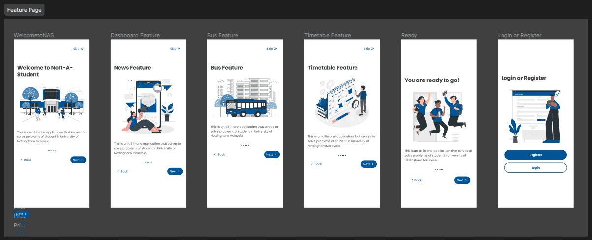
News Page
The news section will display all the events of the clubs and societies of the university that will be held. This includes a picture of the poster, title, short description, and most importantly the date and time of the event. In order to be more engaging, a banner section of upcoming events will be implemented to display an event that will be highlighted more. There is also a row of chips to allows user to filter out based on the category.


Bus Features Exploration
Utilizing rough notes to display all the possible features that can be implemented into the app can be very beneficial. This allows for a more creative way and out of the box solution to a problem.

Bus Wireframe
To have visualization of what the app will look like, creating wireframe is an important step. By drawing all the components, we are able to come up with features that might be useful and beneficial for the user. This also ensure that the design can be iterated over many times to include as much feasible features.
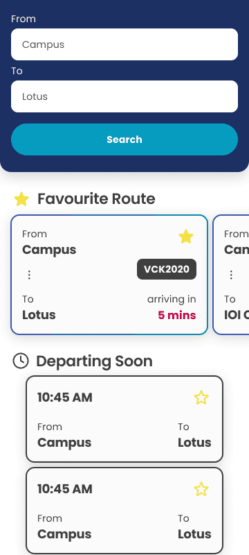
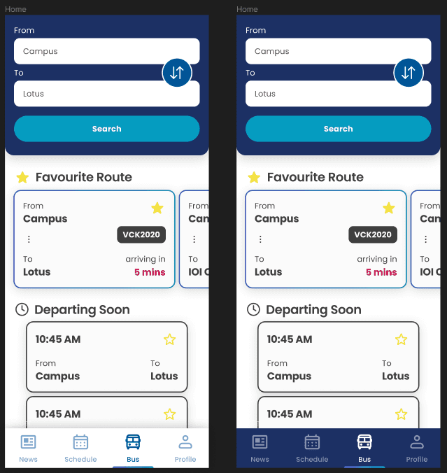
One such feature is the switch button that can be found in between the To and From field. This simple button allows user to easily switch the destination. This is found by our personal experience in using the app since the campus will be in one of the arrival/departure spot.
The other feature is the favourites route that can be found underneath the search section. This feature allows users of the app to save/pin/favourites their most used route in order to be more efficient to navigate through the app. Every route is enclosed within a card to give a visual separation and a distinct look to differentiate from other components.
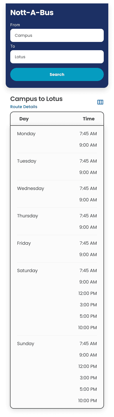
Moreover, we came up with two scheduling views: Day and Schedule. The day views display the timing on that particular day only meanwhile the schedule displays the timing for the entire week. This provides the user a flexibility on their preferred view. Not only that, in the day view, we included a timeline bar that is dynamic to the current timing and scrolls to the respective current time. This provides the user a way to know what the current time is. This idea came up during exploration stage to which we are inspired by Google Calendar.

Bus Final Design
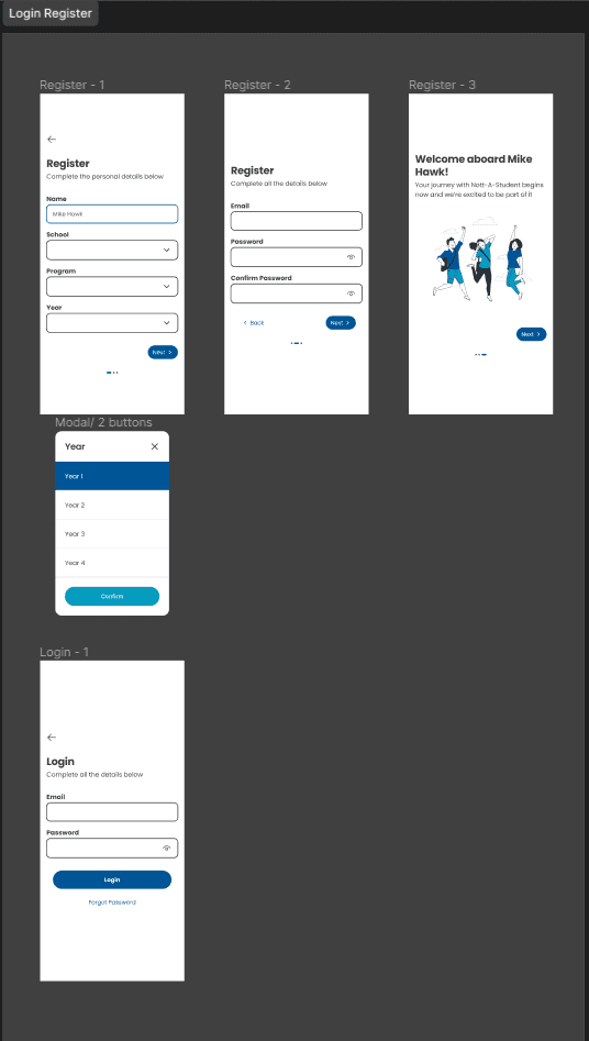
Furthermore, the final design version includes input from both project stakeholders and end-users to ensure it aligns with both project requirements and user expectations. The inclusion of necessary components, such as intuitive navigation menus, clear call-to-action buttons, and consistent branding elements, enhances the overall usability of the application. The way users navigate through the app was carefully planned to be smooth, intuitive and enjoyable. While following the standard design rules, I also added my own style to give the app a unique feel. This personal touch is meant to make the app not just practical but also visually appealing and memorable for users. It strikes a balance between my style, overall design standards, and what works well for users. The result is a design that not only does what it's supposed to but also thinks about users first and keeping the app's visual aesthetics and interaction design.

Remarks
This project has provided me the experience in working within a team environment. By working on a team, I have more inputs and feedbacks on the design that results in a more objectively better app experience.
Problem Statement
My role in this project is to standardized the styling of the user interface of the app since there was no dedicated designer that handled this project as well as taking in charge in the entire UI/UX design of the Bus feature. In order to standardized the design of the app, design system is being used to ensure consistency across the user interface.
By adopting a design system, we aim to establish a cohesive visual language and standardized components that maintain a unified look and feel throughout the application. This involves defining consistent color palettes, typography, and UI elements to create a seamless and intuitive user experience.
My focus on the Bus feature involves designing an interface that is not only aesthetically pleasing but also user-friendly and efficient. This includes optimizing the user flow for bus-related functionalities, such as route selection, real-time tracking, and any additional features to enhance the overall user experience.
Through these efforts, the goal is to contribute to a visually appealing and user-centric application, ensuring a positive interaction for all users while maintaining a coherent and standardized design system across the entire platform.
Objectives
The objective of this project is to build an application design that will be used in the university's settings in which it will be the main hub to access valuable information and utilities. The main features that will be implemented are as follows:
Dashboard to display the home page that consists of newsletter from clubs and societies of the university
Timetable to provide users to display their personalized schedule and timetable
Bus to easily display the users the schedule of the bus and notify them
Profile to have a digital identity information
Login / Register Page
Feature Page
News Page
The news section will display all the events of the clubs and societies of the university that will be held. This includes a picture of the poster, title, short description, and most importantly the date and time of the event. In order to be more engaging, a banner section of upcoming events will be implemented to display an event that will be highlighted more. There is also a row of chips to allows user to filter out based on the category.
Bus Features Exploration
Utilizing rough notes to display all the possible features that can be implemented into the app can be very beneficial. This allows for a more creative way and out of the box solution to a problem.
Bus Wireframe
To have visualization of what the app will look like, creating wireframe is an important step. By drawing all the components, we are able to come up with features that might be useful and beneficial for the user. This also ensure that the design can be iterated over many times to include as much feasible features.
One such feature is the switch button that can be found in between the To and From field. This simple button allows user to easily switch the destination. This is found by our personal experience in using the app since the campus will be in one of the arrival/departure spot.
The other feature is the favourites route that can be found underneath the search section. This feature allows users of the app to save/pin/favourites their most used route in order to be more efficient to navigate through the app. Every route is enclosed within a card to give a visual separation and a distinct look to differentiate from other components.
Moreover, we came up with two scheduling views: Day and Schedule. The day views display the timing on that particular day only meanwhile the schedule displays the timing for the entire week. This provides the user a flexibility on their preferred view. Not only that, in the day view, we included a timeline bar that is dynamic to the current timing and scrolls to the respective current time. This provides the user a way to know what the current time is. This idea came up during exploration stage to which we are inspired by Google Calendar.
Bus Final Design
Furthermore, the final design version includes input from both project stakeholders and end-users to ensure it aligns with both project requirements and user expectations. The inclusion of necessary components, such as intuitive navigation menus, clear call-to-action buttons, and consistent branding elements, enhances the overall usability of the application. The way users navigate through the app was carefully planned to be smooth, intuitive and enjoyable. While following the standard design rules, I also added my own style to give the app a unique feel. This personal touch is meant to make the app not just practical but also visually appealing and memorable for users. It strikes a balance between my style, overall design standards, and what works well for users. The result is a design that not only does what it's supposed to but also thinks about users first and keeping the app's visual aesthetics and interaction design.
Remarks
This project has provided me the experience in working within a team environment. By working on a team, I have more inputs and feedbacks on the design that results in a more objectively better app experience.
Role:
UI/UX Designer
Role:
UI/UX Designer
Role:
UI/UX Designer
Duration:
1 Week
Duration:
1 Week
Duration:
1 Week
Links
Figma
Others
GitHub Repo
Others
Links
Figma
Others
GitHub Repo
Others
Links
Figma
Others
GitHub Repo
Others
Links
Figma
Others
GitHub Repo
Others