Enrichment Class
UI/UX Design
Pandai
Education


eLADAP is one product from Pandai which is a professional development initiative implemented by way of an exclusive enrichment class tailored specifically for Malaysia teachers to enhance the excellence in education.
My role in this project as a UI/UX Designer is to create a more engaging product that facilitates seamless navigation for teachers but also ensures an immersive and user-friendly experience. The aim is to contribute to the success of eLADAP in empowering Malaysian teachers and fostering a community of educators dedicated to continuous improvement and excellence in the field of education.
Moreover, I initiated the initial product design for Pandai's very own upskilling platform catered to primary and secondary school students where students are able to preview, buy, enroll, and earn certificates for the courses.
Enrichment Class
UI/UX Design
Pandai
Education
eLADAP is one product from Pandai which is a professional development initiative implemented by way of an exclusive enrichment class tailored specifically for Malaysia teachers to enhance the excellence in education.
My role in this project as a UI/UX Designer is to create a more engaging product that facilitates seamless navigation for teachers but also ensures an immersive and user-friendly experience. The aim is to contribute to the success of eLADAP in empowering Malaysian teachers and fostering a community of educators dedicated to continuous improvement and excellence in the field of education.
Moreover, I initiated the initial product design for Pandai's very own upskilling platform catered to primary and secondary school students where students are able to preview, buy, enroll, and earn certificates for the courses.
eLADAP Web Redesign
eLADAP is dedicated to providing teachers with courses that are crafted to enhance their teaching abilities. Engaging in eLADAP courses ensures that Malaysian teachers not only refine their teaching skills but also stay updated on the latest educational trends. By participating in this program, educators are well-prepared to navigate the ever-evolving landscape of modern classrooms.
Summary of the Product Requirement Document (PRD)

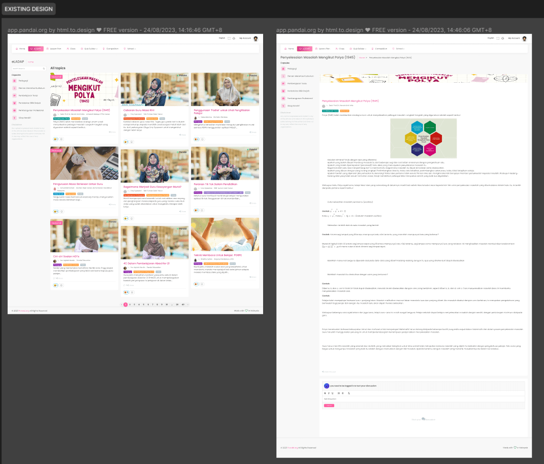
BEFORE (Existing Design)
AFTER (Final Design)

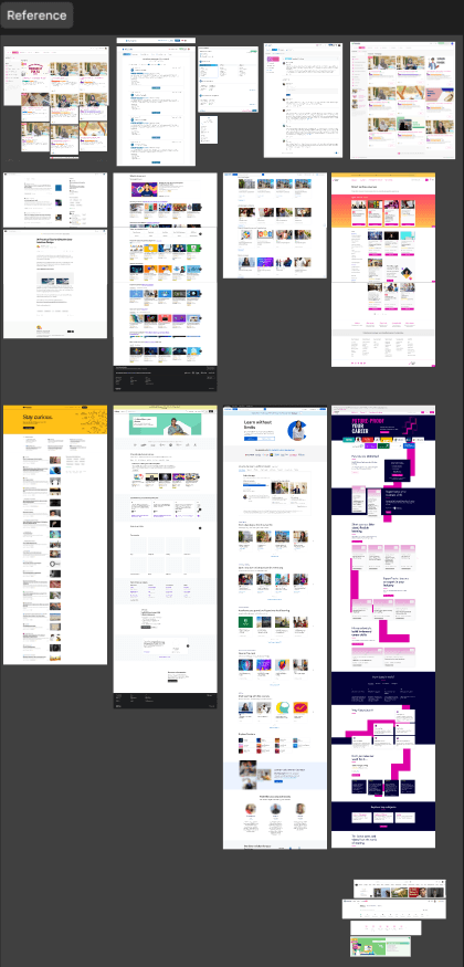
Inspiration
In order to keep up with the industry trends specifically in education, I have created a section in Figma containing all the websites that is related to the page to be designed. This includes websites such as:
Medium
Udemy
Coursera
FutureLearn
This process of analyzing what the competitor is doing is a crucial steps since we can learn and explore why the pages are designed to be that way.
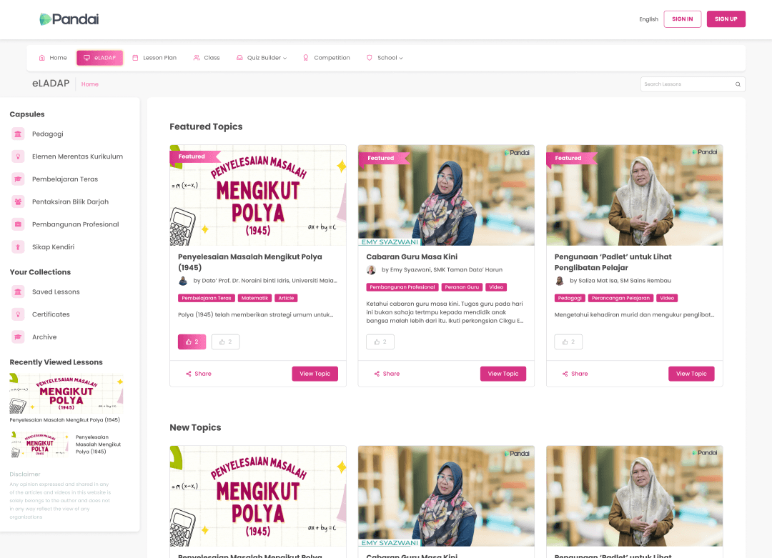
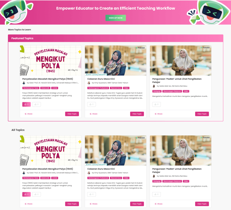
Home Page
In the home page of eLADAP, some modifications are made in the aim to have the user interface more user-friendly and accessible in order for teachers with various range of tech proficiency to be able to use this product easily.
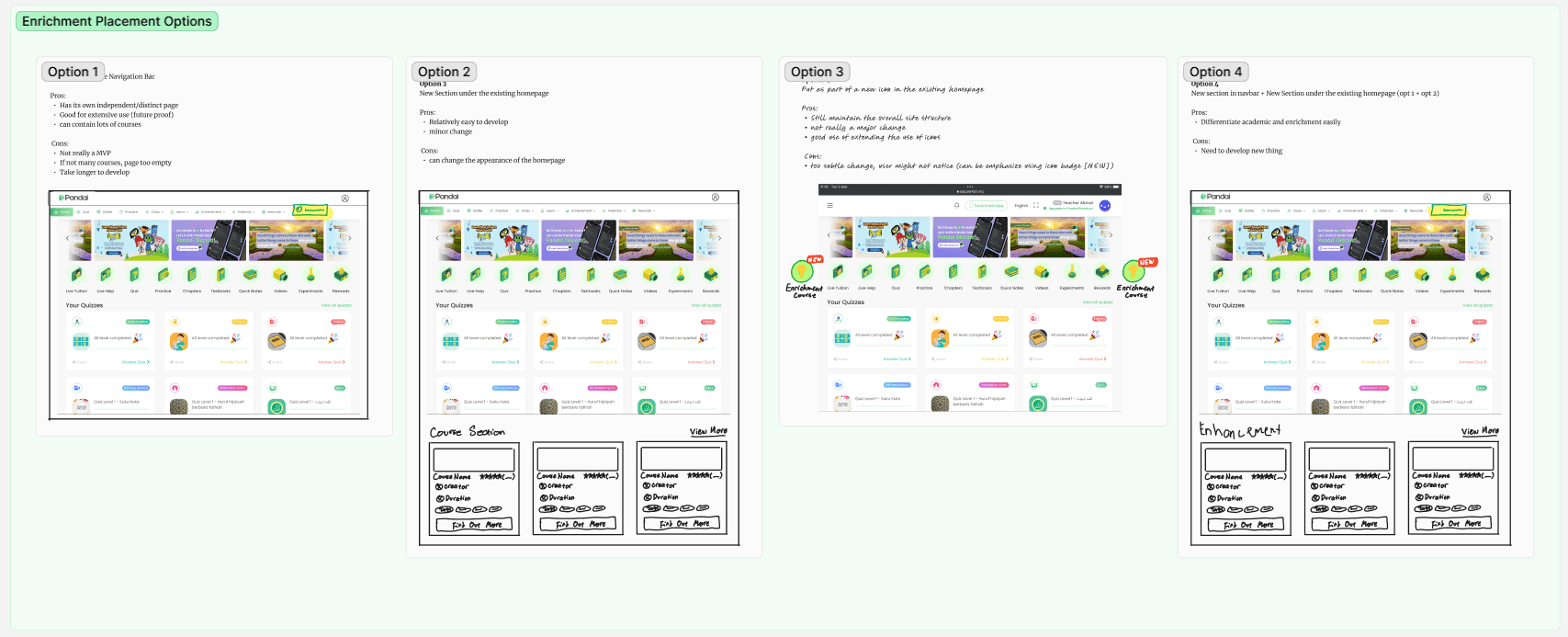
The first component that is being modified is the capsule container. In the existing design, it is fixed in place to the left side of the screen. This creates an issue in the responsiveness of the display when is used on different devices.
My first design is to create a collapsible container that can be expanded and collapsed. This offers the flexibility of the view depending on the preferred view of the user. This design is adaptive towards the user.
The second option is to implement a container which is placed on the top of the courses card. By using icons and labels, this is more accessible and since it works similar to a carousel, the user can interact to see all the available capsules categories.
In the end, after proposing these available options by addressing all the features, pros, and cons of each design, the first option is chosen since it is consistent with the current design system and the look and feel of it.
The courses card is also being changed around in order to accommodate all the valuable information such as course title, course creator, course categories, as well as brief description of the course. Visual hierarchy and white space plays a crucial role in order to create a card that is pleasant looking while still be easily readable. By sticking to one colour scheme in the categories tags, we are able to maintain the consistent look of the page. Two call to action buttons are being placed at the bottom separated by the border to create a distinct action for users to interact with.


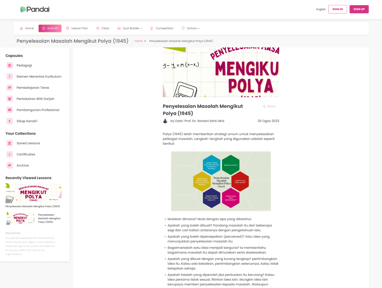
Course
Inside the eLADAP course, since the course are mostly text-based, we have opted to have the website to look like what they have in Medium. This means that the article section will be centered in the page with spacious white space on the sides. This is done for functionality which is to be able to read the articles easily and also for responsiveness of the web since this same page will have similar appearance in mobile devices.

In the bottom of the page, to increase the engagement and encouraging users to discover other courses, we have placed a simplified view of the course cards in order for user to explore other courses in a few clicks. A banner with a distinct CTA button is also placed to be more engaging.

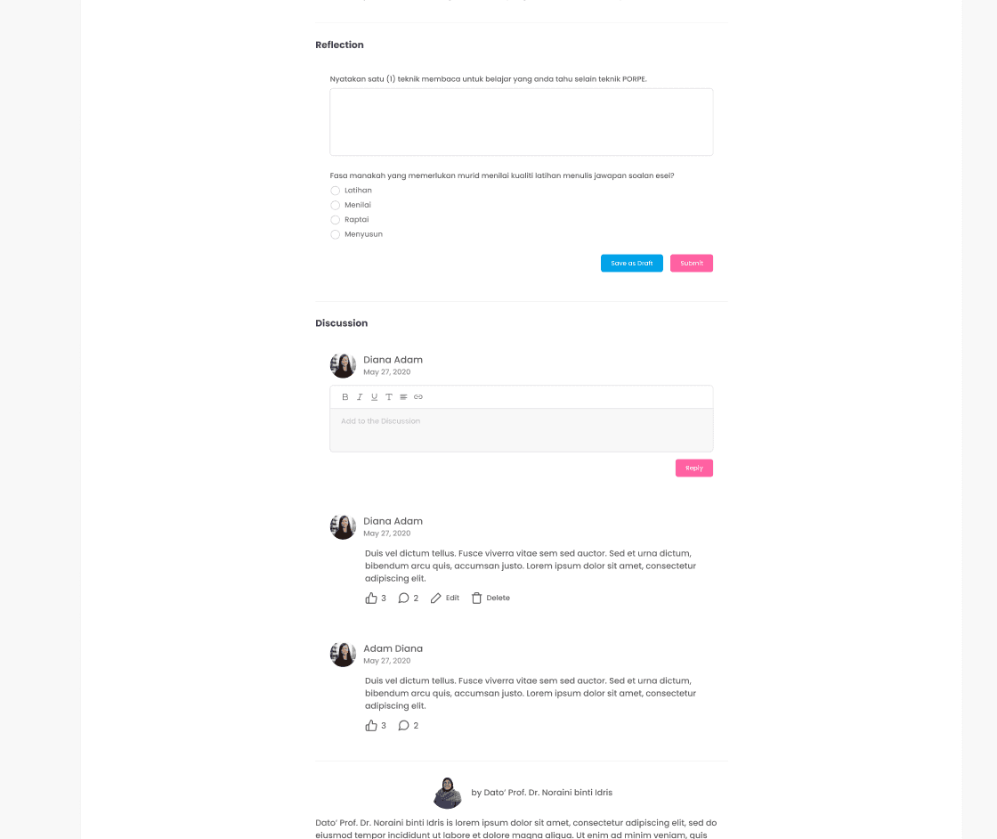
If the user is logged in when viewing the courses, there are several functions that they can achieve such as answering questions in the form of reflection as well as participate in discussion with other users.
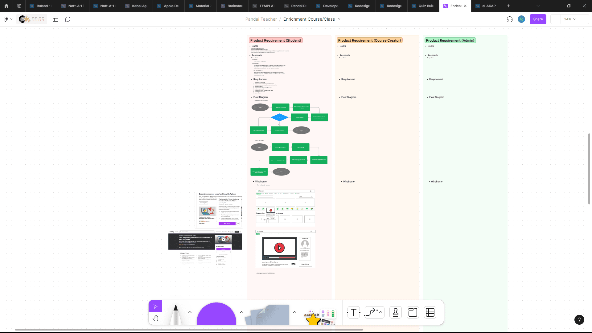
Enrichment Class
Enrichment class is a new feature product that Pandai will be implementing. It is a upskilling platform catered to primary and secondary school students where they are able to preview, buy, enroll, and earn certificates for the courses.
With this goal in mind, my task for this project is to create a low fidelity prototype to visualize what the web page will look like by including all the necessary components.


Remarks
This project has exposed me to the real-world web application that actual users use. This means that the design I have created will be developed by the engineering department's developer and be delivered to an actual user. This taught to create an impactful impact through the medium of user interface and experience design.
eLADAP Web Redesign
eLADAP is dedicated to providing teachers with courses that are crafted to enhance their teaching abilities. Engaging in eLADAP courses ensures that Malaysian teachers not only refine their teaching skills but also stay updated on the latest educational trends. By participating in this program, educators are well-prepared to navigate the ever-evolving landscape of modern classrooms.
Summary of the Product Requirement Document (PRD)
BEFORE (Existing Design)
AFTER (Final Design)
Inspiration
In order to keep up with the industry trends specifically in education, I have created a section in Figma containing all the websites that is related to the page to be designed. This includes websites such as:
Medium
Udemy
Coursera
FutureLearn
This process of analyzing what the competitor is doing is a crucial steps since we can learn and explore why the pages are designed to be that way.
Home Page
In the home page of eLADAP, some modifications are made in the aim to have the user interface more user-friendly and accessible in order for teachers with various range of tech proficiency to be able to use this product easily.
The first component that is being modified is the capsule container. In the existing design, it is fixed in place to the left side of the screen. This creates an issue in the responsiveness of the display when is used on different devices.
My first design is to create a collapsible container that can be expanded and collapsed. This offers the flexibility of the view depending on the preferred view of the user. This design is adaptive towards the user.
The second option is to implement a container which is placed on the top of the courses card. By using icons and labels, this is more accessible and since it works similar to a carousel, the user can interact to see all the available capsules categories.
In the end, after proposing these available options by addressing all the features, pros, and cons of each design, the first option is chosen since it is consistent with the current design system and the look and feel of it.
The courses card is also being changed around in order to accommodate all the valuable information such as course title, course creator, course categories, as well as brief description of the course. Visual hierarchy and white space plays a crucial role in order to create a card that is pleasant looking while still be easily readable. By sticking to one colour scheme in the categories tags, we are able to maintain the consistent look of the page. Two call to action buttons are being placed at the bottom separated by the border to create a distinct action for users to interact with.
Course
Inside the eLADAP course, since the course are mostly text-based, we have opted to have the website to look like what they have in Medium. This means that the article section will be centered in the page with spacious white space on the sides. This is done for functionality which is to be able to read the articles easily and also for responsiveness of the web since this same page will have similar appearance in mobile devices.
In the bottom of the page, to increase the engagement and encouraging users to discover other courses, we have placed a simplified view of the course cards in order for user to explore other courses in a few clicks. A banner with a distinct CTA button is also placed to be more engaging.
If the user is logged in when viewing the courses, there are several functions that they can achieve such as answering questions in the form of reflection as well as participate in discussion with other users.
Enrichment Class
Enrichment class is a new feature product that Pandai will be implementing. It is a upskilling platform catered to primary and secondary school students where they are able to preview, buy, enroll, and earn certificates for the courses.
With this goal in mind, my task for this project is to create a low fidelity prototype to visualize what the web page will look like by including all the necessary components.
Remarks
This project has exposed me to the real-world web application that actual users use. This means that the design I have created will be developed by the engineering department's developer and be delivered to an actual user. This taught to create an impactful impact through the medium of user interface and experience design.
Role:
UI/UX Designer
Role:
UI/UX Designer
Role:
UI/UX Designer
Duration:
2 Weeks
Duration:
2 Weeks
Duration:
2 Weeks
Links
Figma
Others
GitHub Repo
Others
Links
Figma
Others
GitHub Repo
Others
Links
Figma
Others
GitHub Repo
Others
Links
Figma
Others
GitHub Repo
Others