TL;DR
Text Accessibility (A11y) Support is an added a11y capability for adaptive text which means our app' text size will follow the system's text size. We successfully added this to our library of design system which includes 40+ components that are currently being used by vertical teams (Flight, Hotel, Platform, etc). The real main challenge is how do we make sure that we can proceed with this enhancement without disrupting and breaking the current live implementation on all 3 platforms (iOS, Android, Web). Some key achievements that we want to highlight:
enabled 500+ stakeholders in product teams to deliver accessible experience
80% adoption rate across product teams supporting 10+ ongoing vertical projects
improved usability of 40+ Design system components by 50%
This case study will let you assess my skills in these key areas:
Design System
Systems Thinking
Accessibility
Human Centriticity
Process Optimization
Project management
Tech Documentation
Stakeholder management
Background
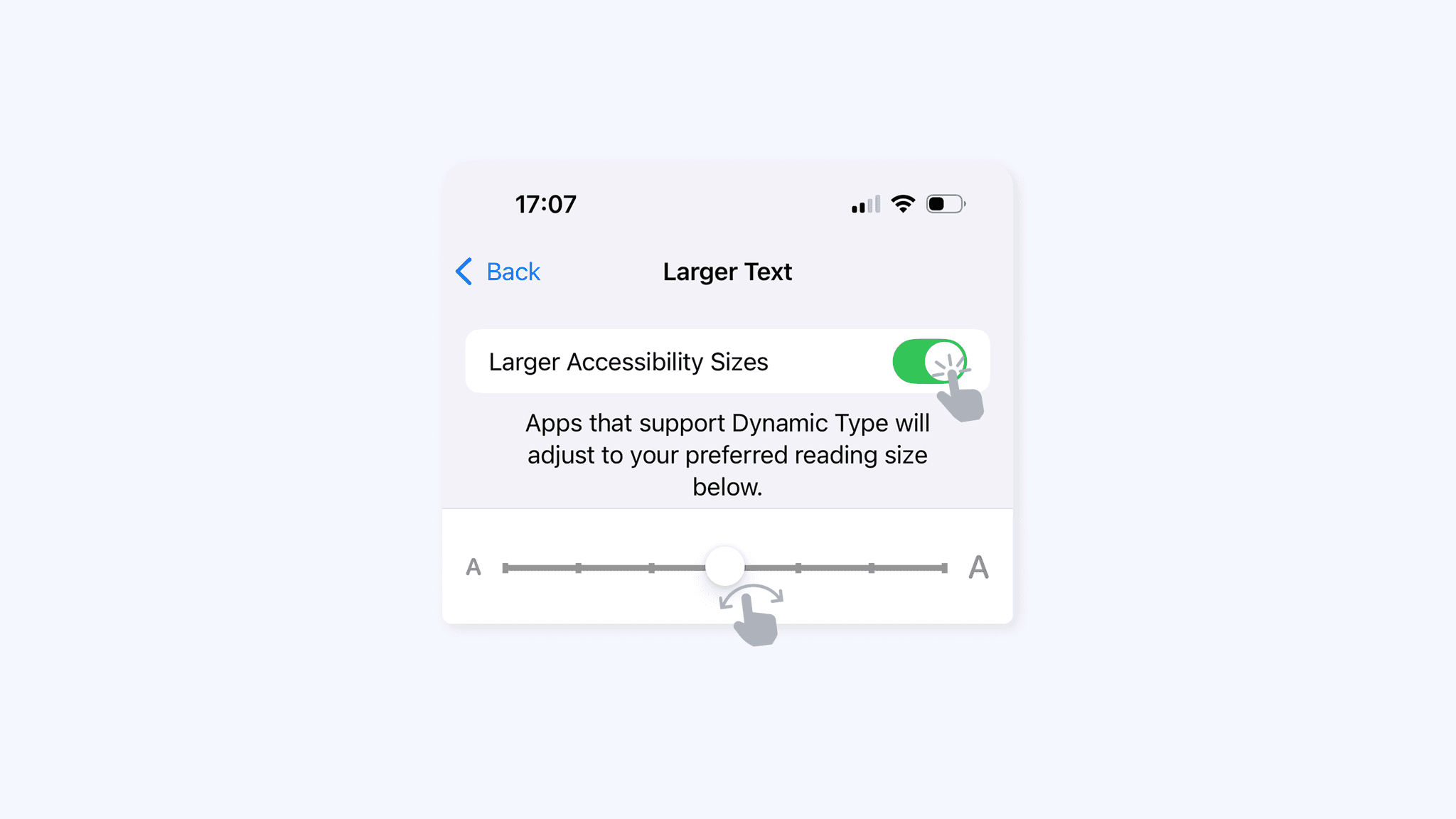
Based on internal research data and findings, we observed that majority of our users are in the 'aging' age group, and looking it more closely one key findings that we found based on eagle eye data is ~24% of those users enlarge their phone's text size from the default size. We realized that a capability to provide the best foundational experience for our users are absent. Dynamic text size, a feature that is nice to have for some users but essential for those in need. It is our upmost goal to make traveling inclusive to all people, and provide the most delightful experience to all user’s whether you’re going for your once in a lifetime vacation or simply going back to your kampung.
Assessing Current Situation
In our current implementation:
🤖 Android
dynamic text size ✅
not broken layout ❌
🍎 iOS
dynamic text size ❌
not broken layout ❌
🌐 Web
dynamic text size ✅
not broken layout ❌
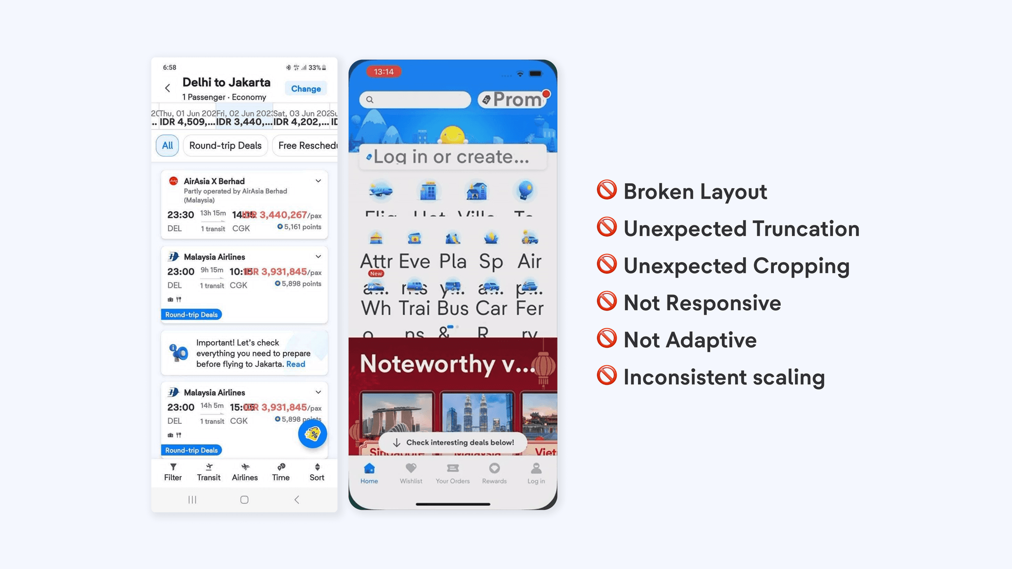
Android users are able to change the text size dynamically, but since we haven't optimized our design to adapt to these changes, some views or components breaks with most text being cutout or cropped unexpectedly. This also applies on the Web platform.
iPhone users are not able to change the text size dynamically, since dynamic text size is not available on tiket.com app. This is due to the use of hardcoded values that doesn't change dynamically.
Setting the Objective
Now that the problem is clear, so how might we:
let user have the ability to change text size on tiket.com app based on their phone's text size setting
let user to browse and read essential crucial information without broken layout, no text being cropped, and minimal text truncation
design a structured, reusable, scalable component guidelines to be suitable for all screen dimensions
implement to production without causing any issue or disruption to current implementation
document a foundational accessibility guideline for verticals or stakeholders to easily adapt their design
get buy-ins from stakeholders to adopt to our updated component capability
Laying out the Foundation
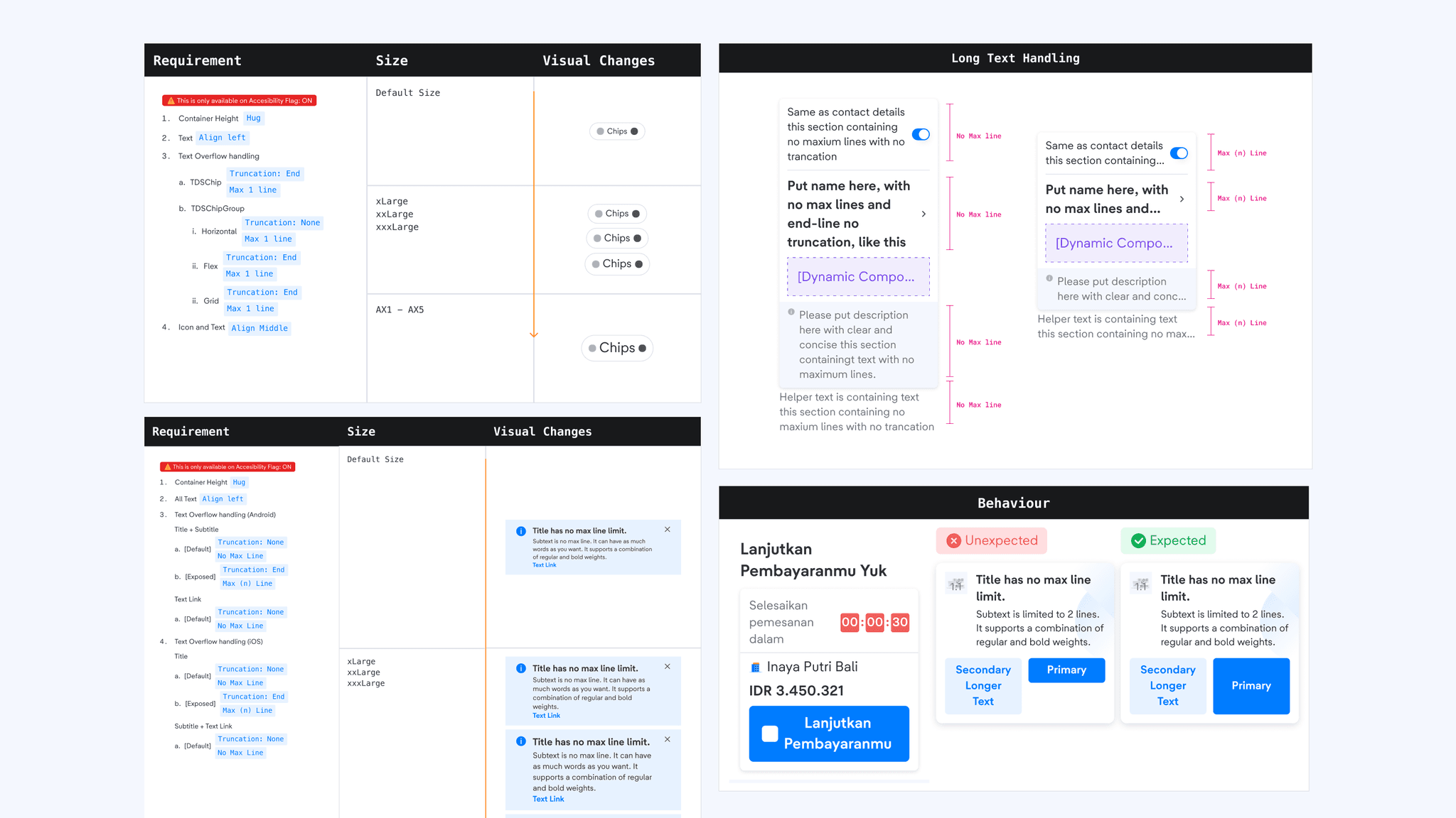
When designing the accessibility capability for our components, we have rules and design technique that we have set up:
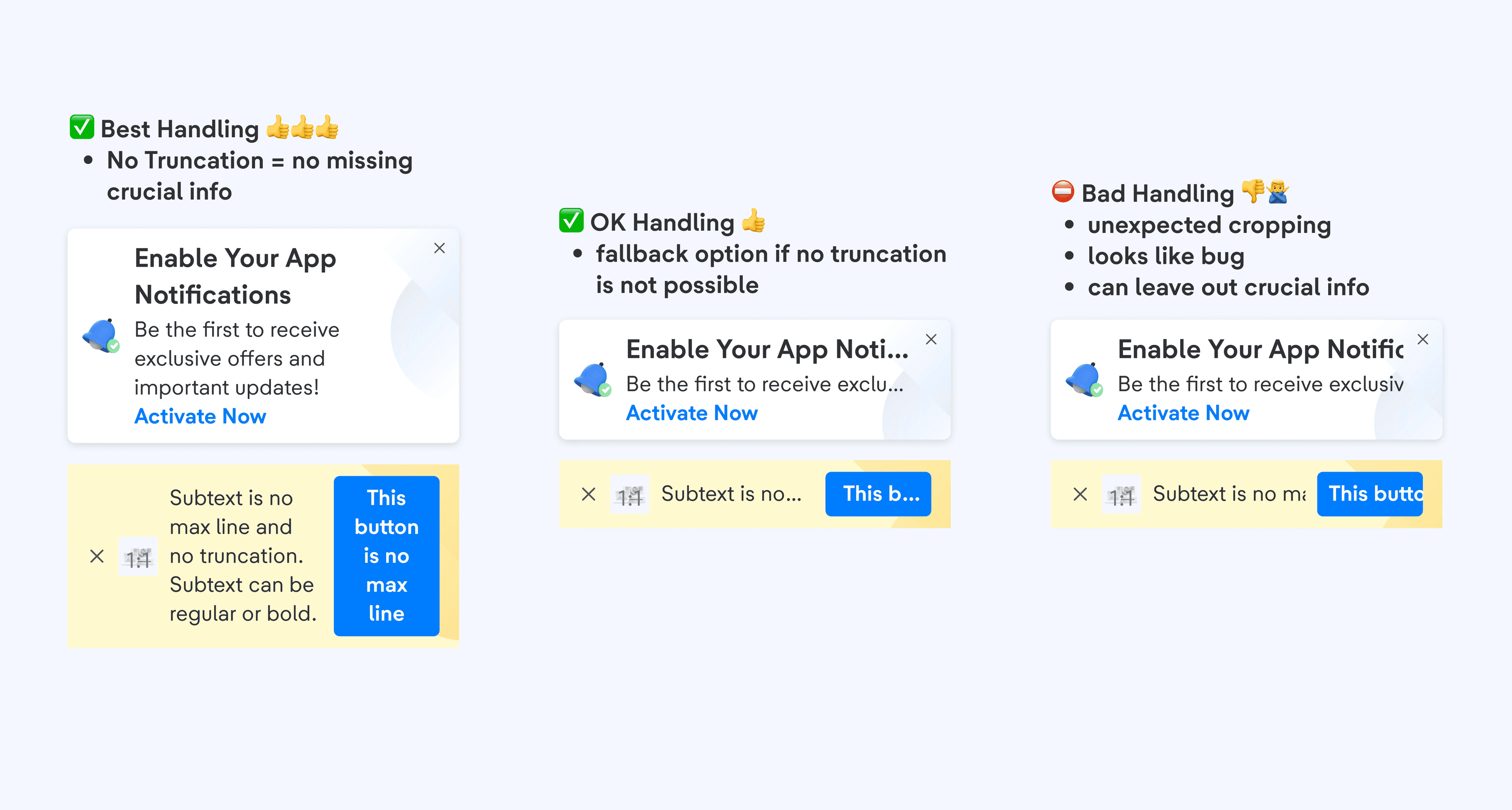
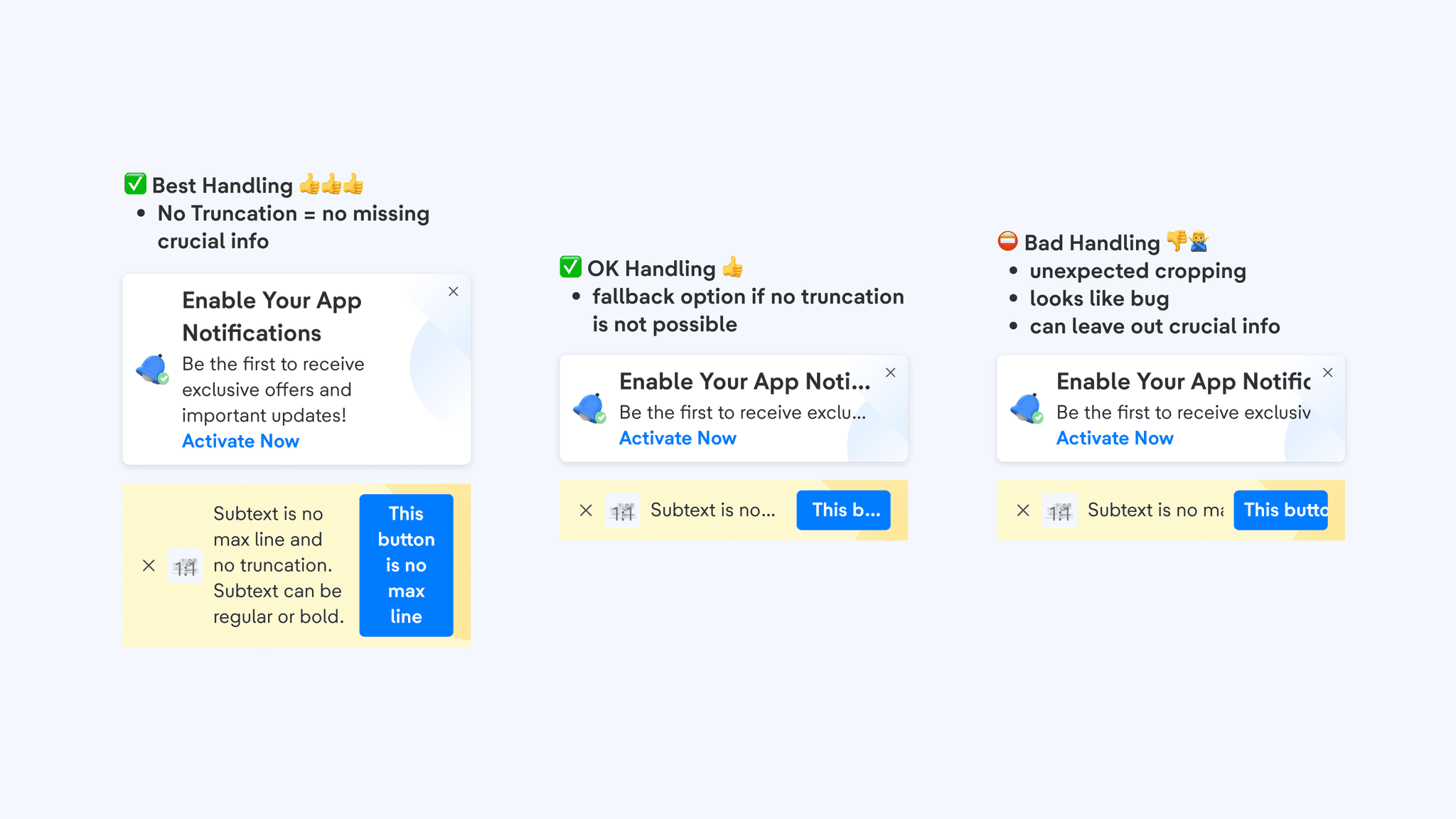
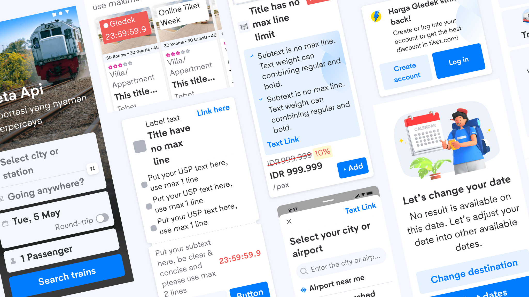
No truncation whenever possible, only reserve truncation for edge cases only.
Truncation on unexpected views can be seemed as a UI bug and perceived as missing information. During crucial times, it can create problems and frustrations for users.
No max line over Truncation
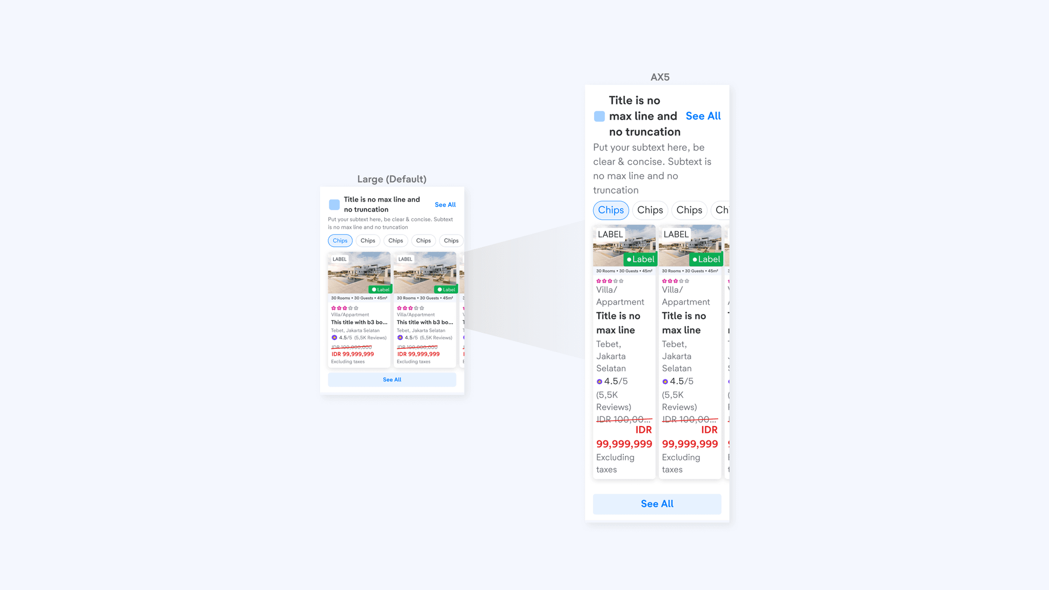
In component level, majority of the components are set to no max line by default, which means it will show 100% of the text content. With the option and ability to expose the truncation method with [n] number of lines.
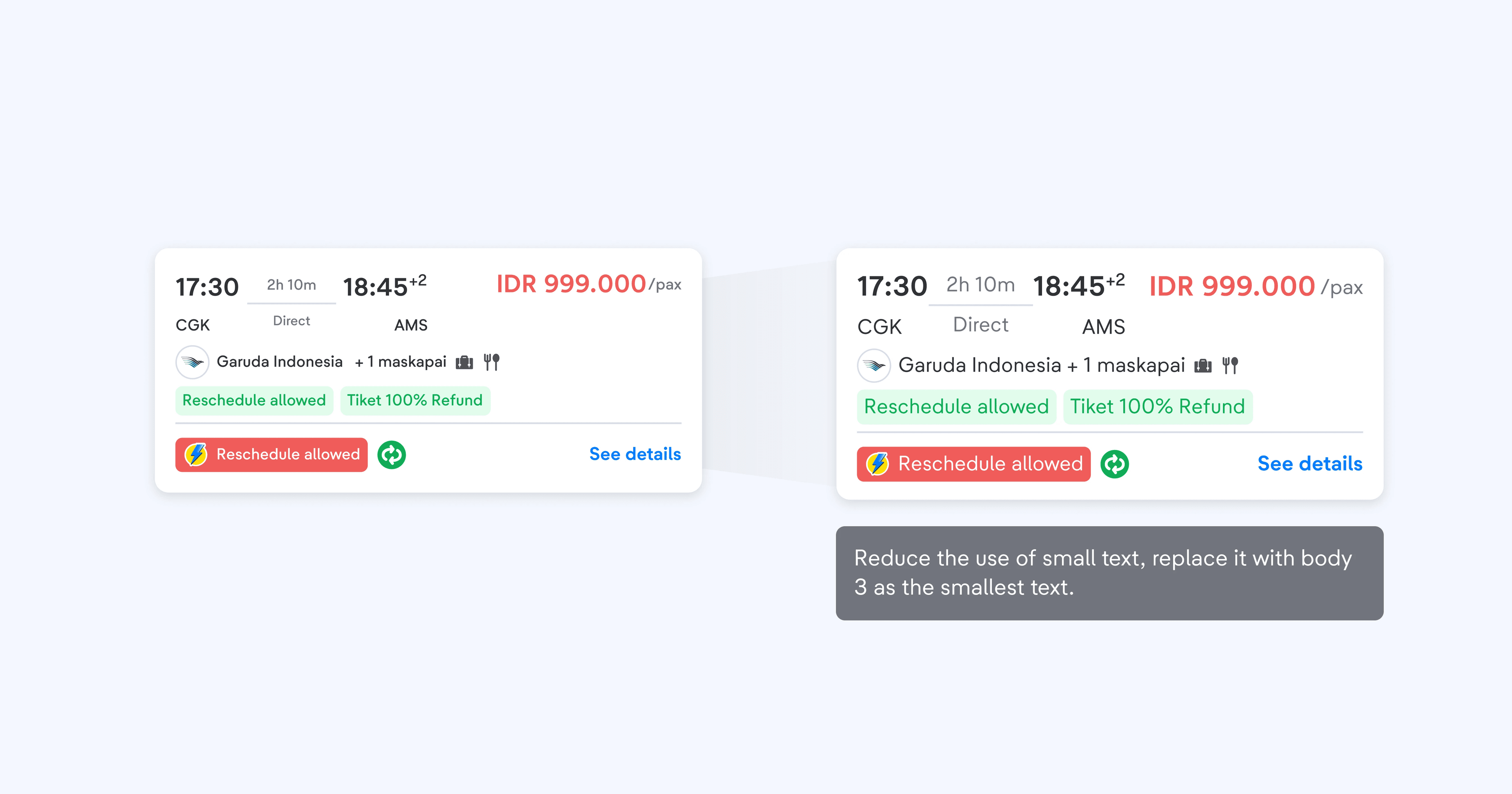
Reduce the use of small text, to only be used in edge cases.
Even though it will be enlarged if text size increases, but it is best to only use it sparingly or even none at all.
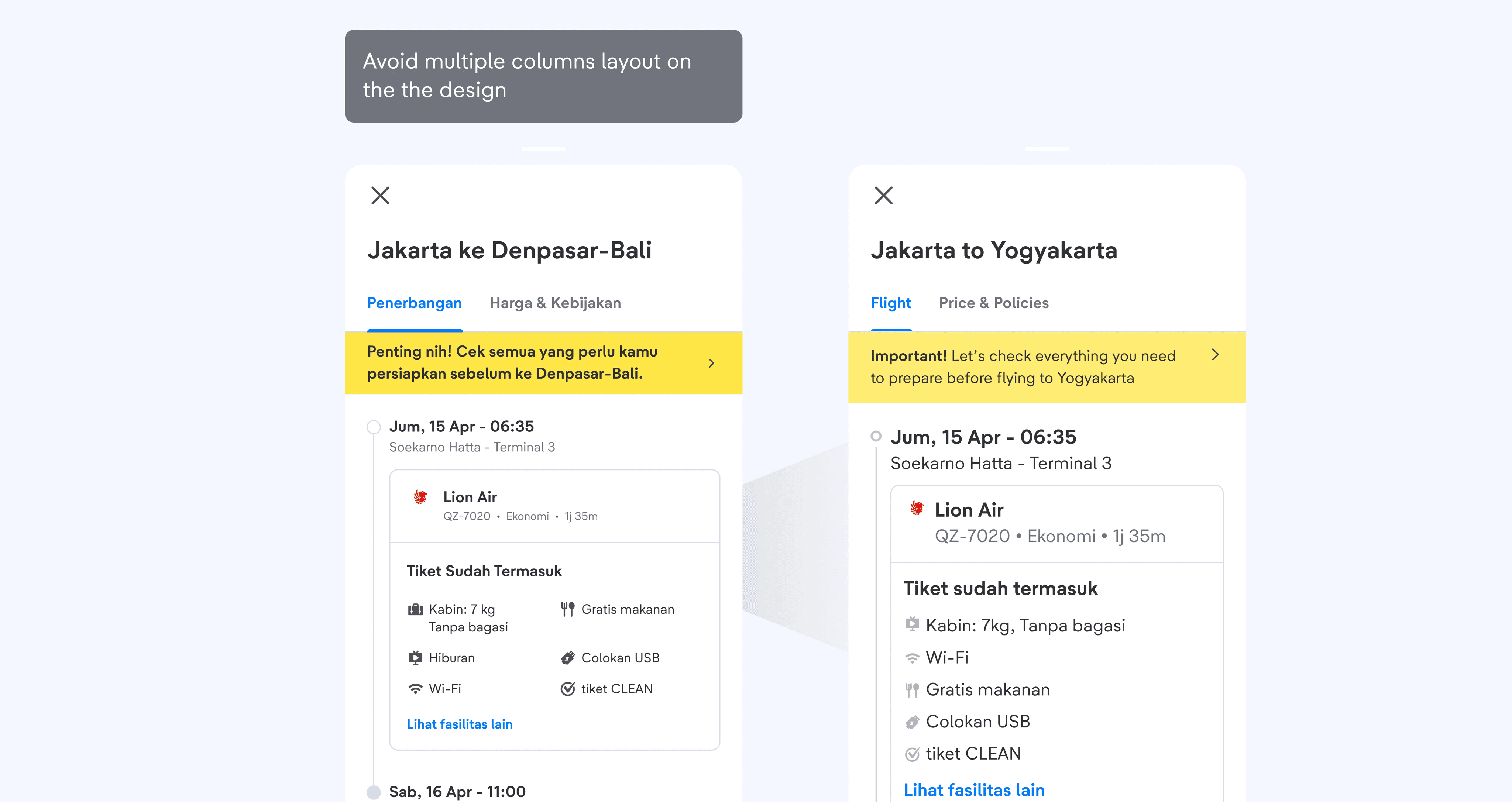
Avoid multiple columns layout in the design.
Side-by-side layout can cause the UI to be broken if not handled properly. To ensure the best experience in all types of devices with various screen sizes, it is best to reduce the usage of multiple columns.
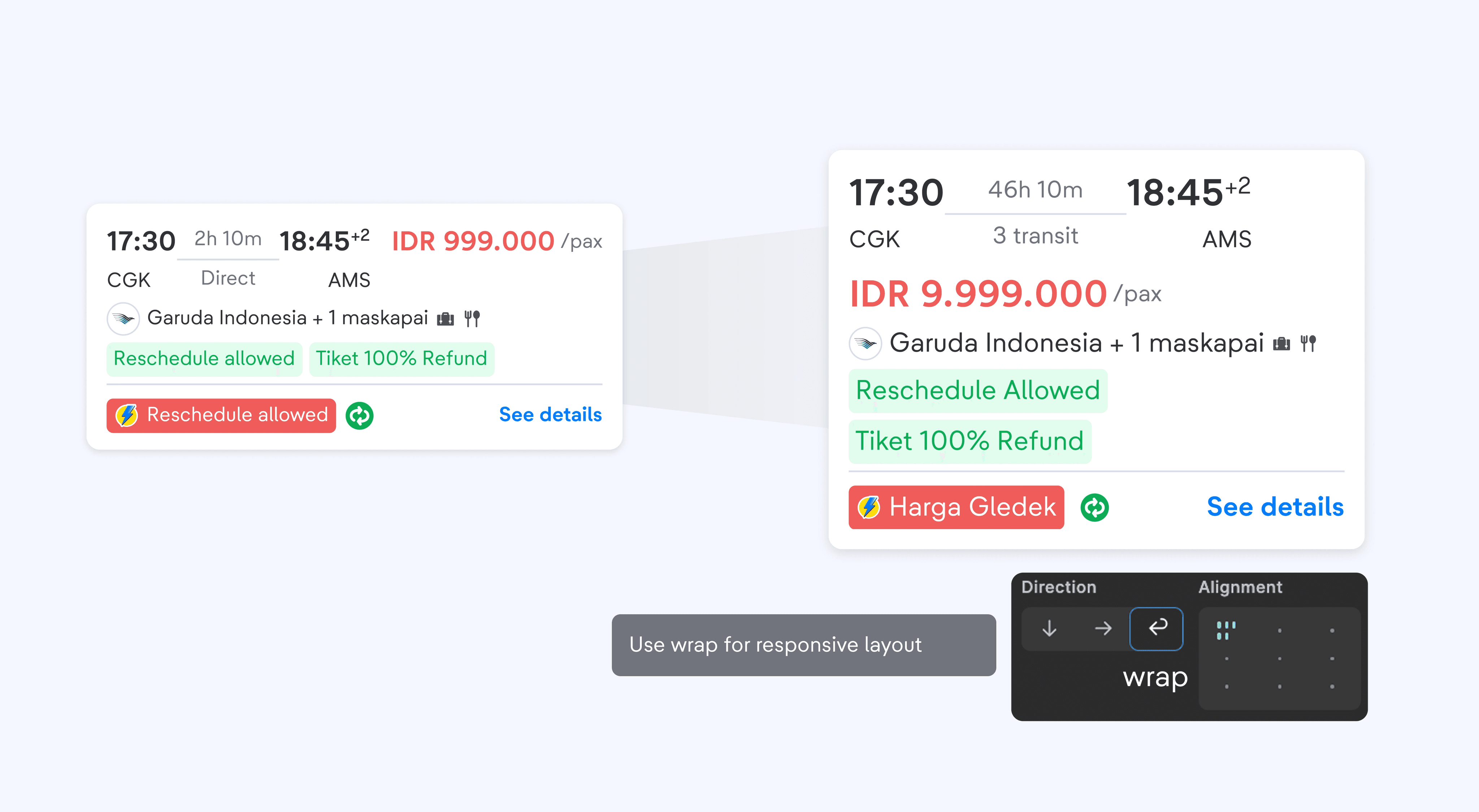
Use wrap layout when handling text overflow.
Wrapping a layout is the best handling when the width of the content exceeds its parent container, since the content can just go to the next line which gives still the full content in display.
Deep Dive on Tech Analysis
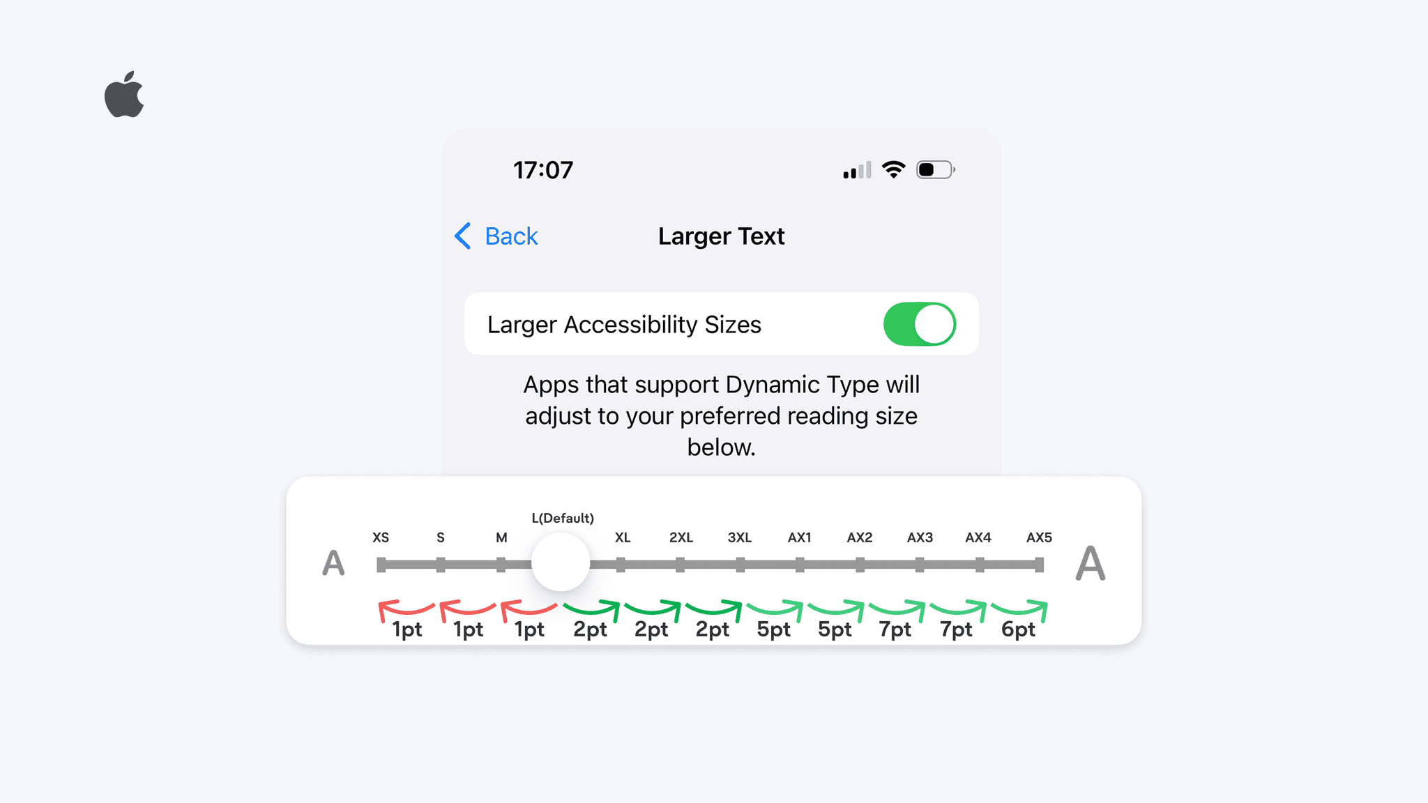
On iOS, we discovered that increment and decrement values are different.
Some adjustments and handlings are agreed upon after discussing thoroughly with the devs.
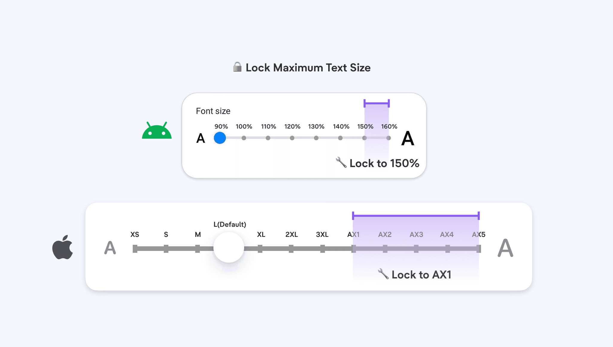
Have text enlarged only up to AX1/150%. So text size AX1 to AX5 will be set to AX1.
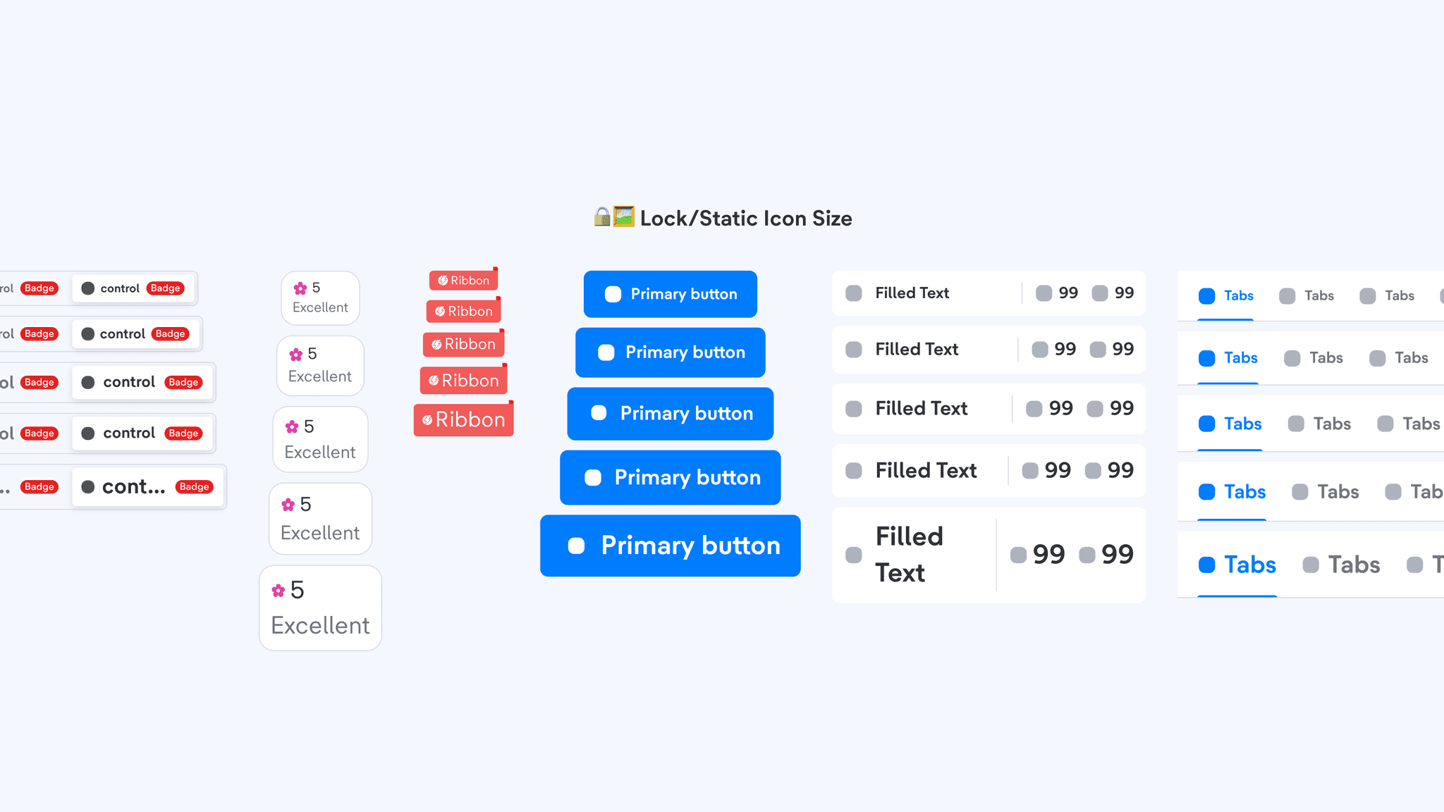
Make the Icon static (non change/fixed size)
Initially we propose to have icon size to enlarge but this causes too much issues as the formula to enlarge does not work in every component leading to consistency issue
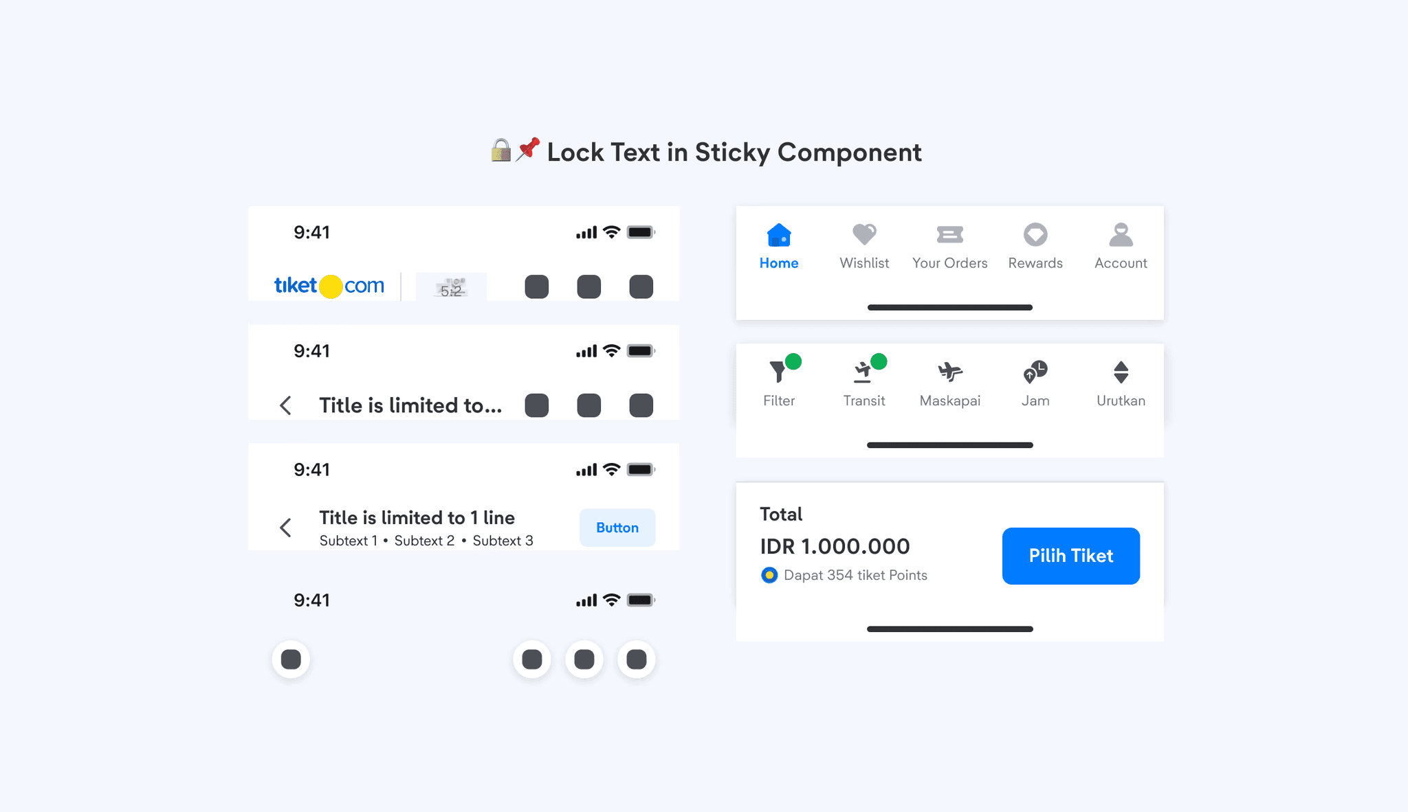
Lock the size of text in a specific component (floating/sticky component)
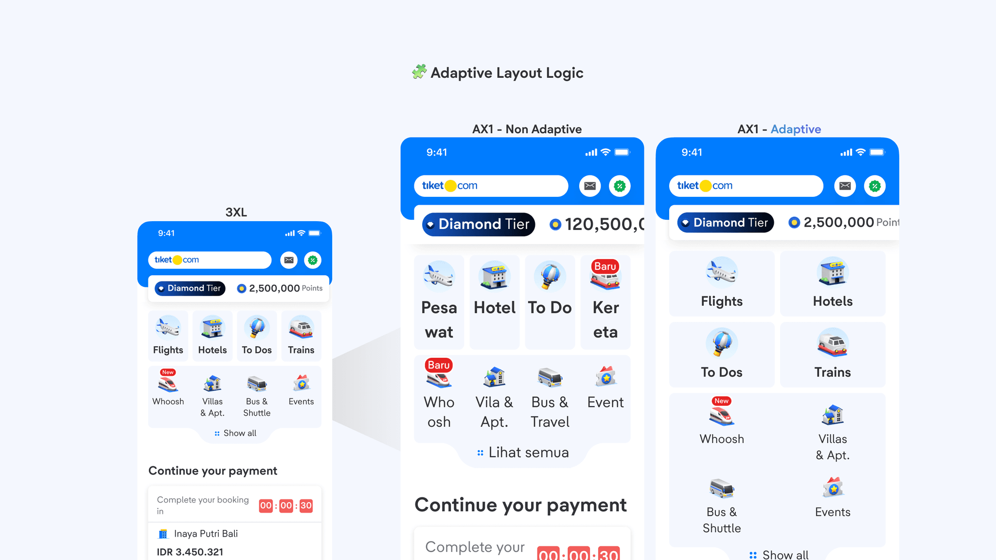
Layout to adapt differently upon certain text size, to give a more personalized layout.
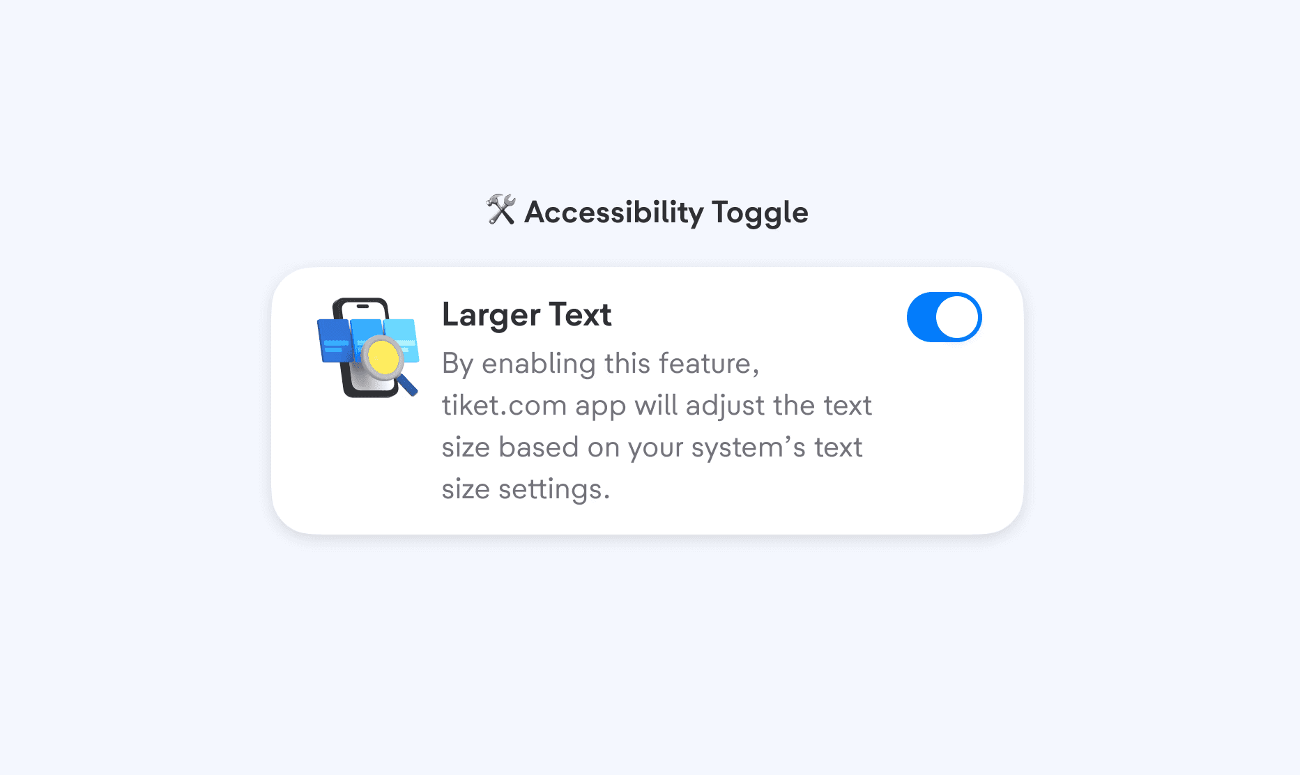
Implement a toggle to turn on and off adaptive text size feature.
Rolling out to First Adopter
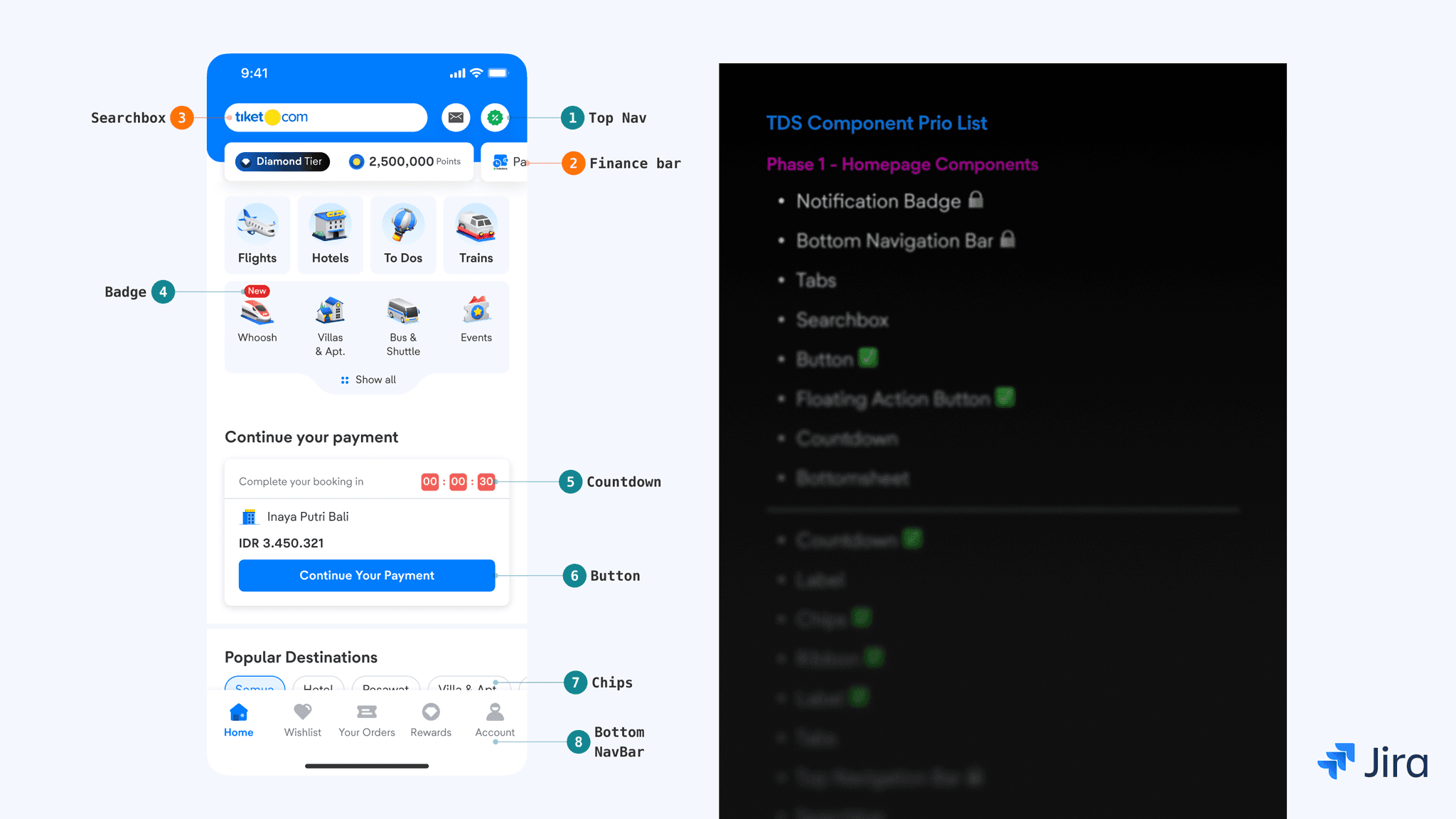
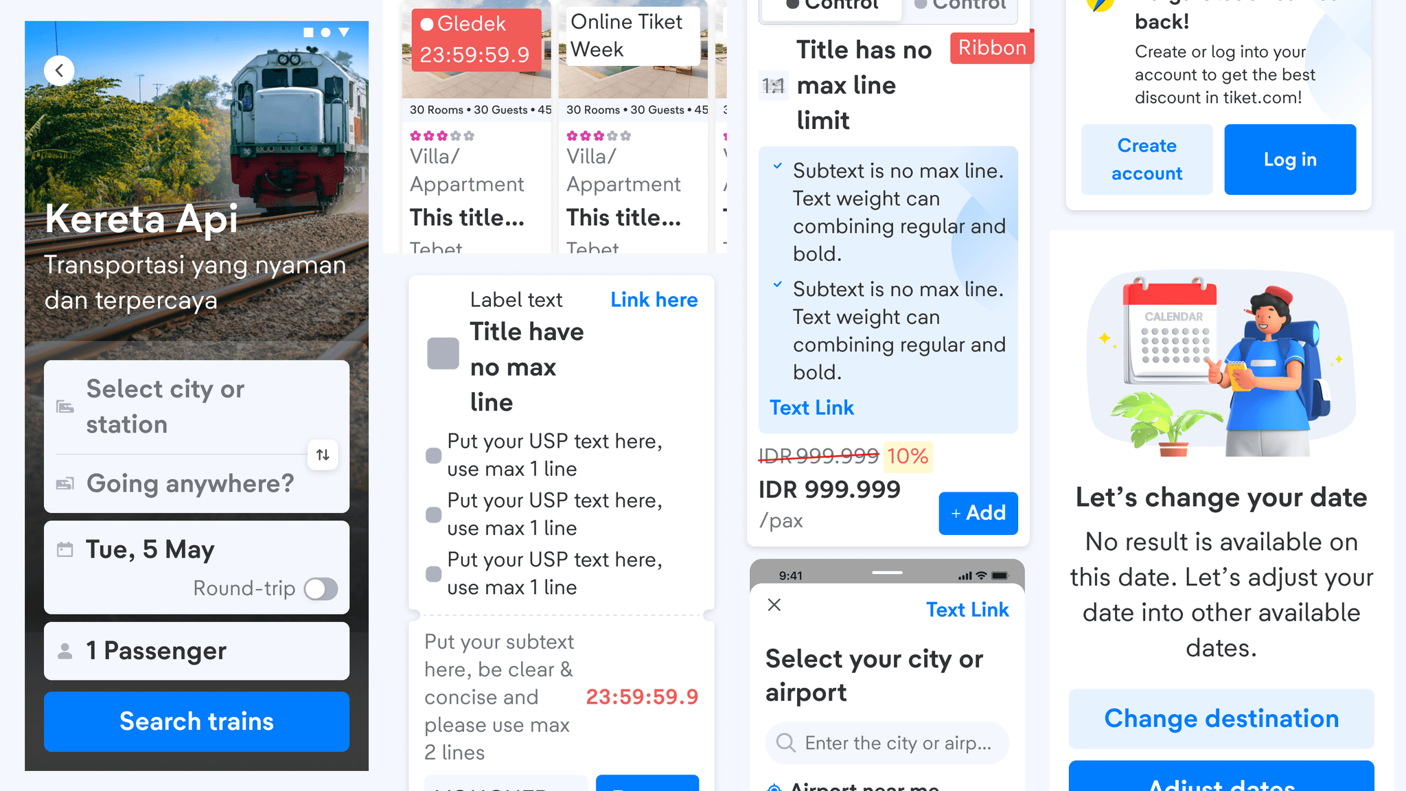
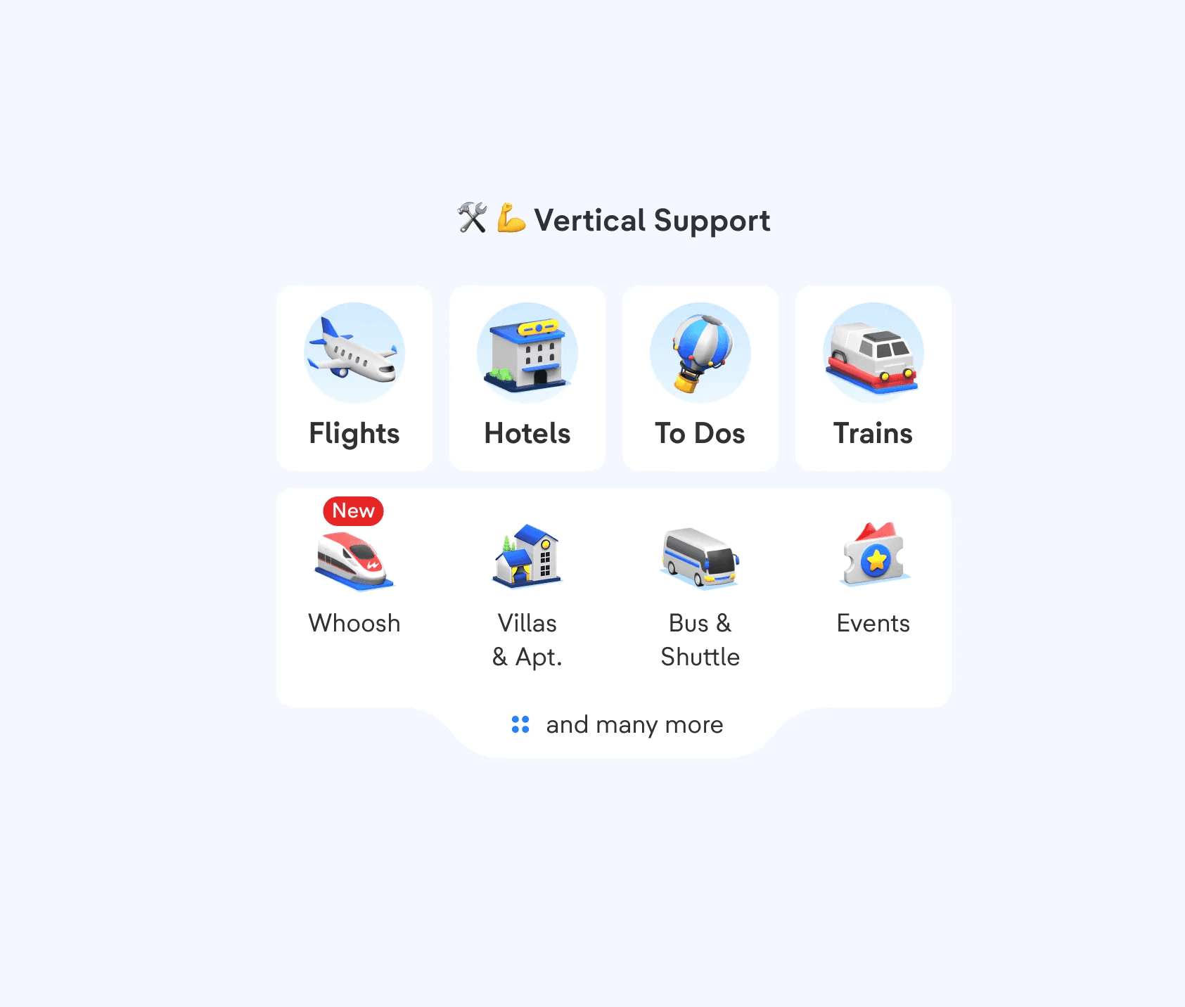
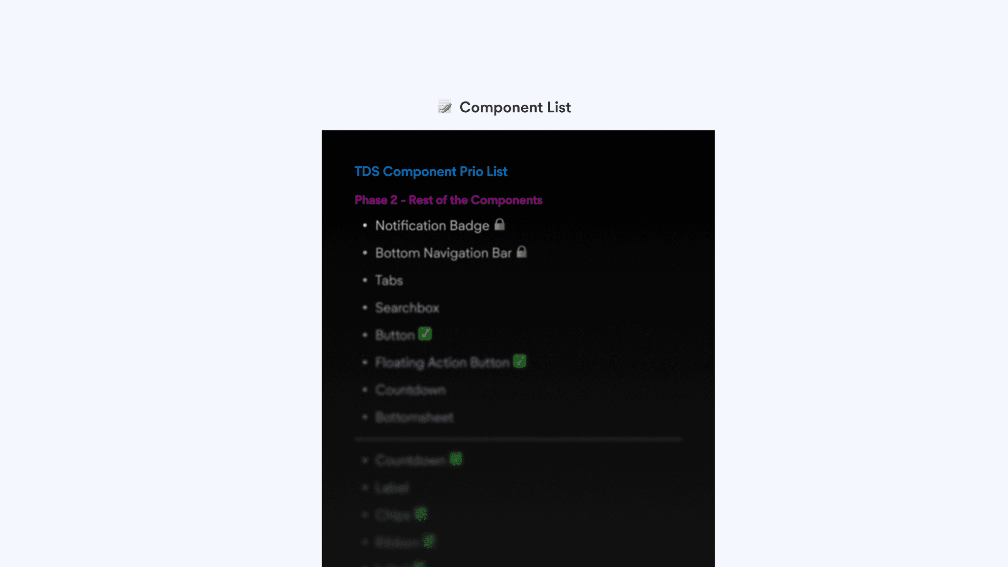
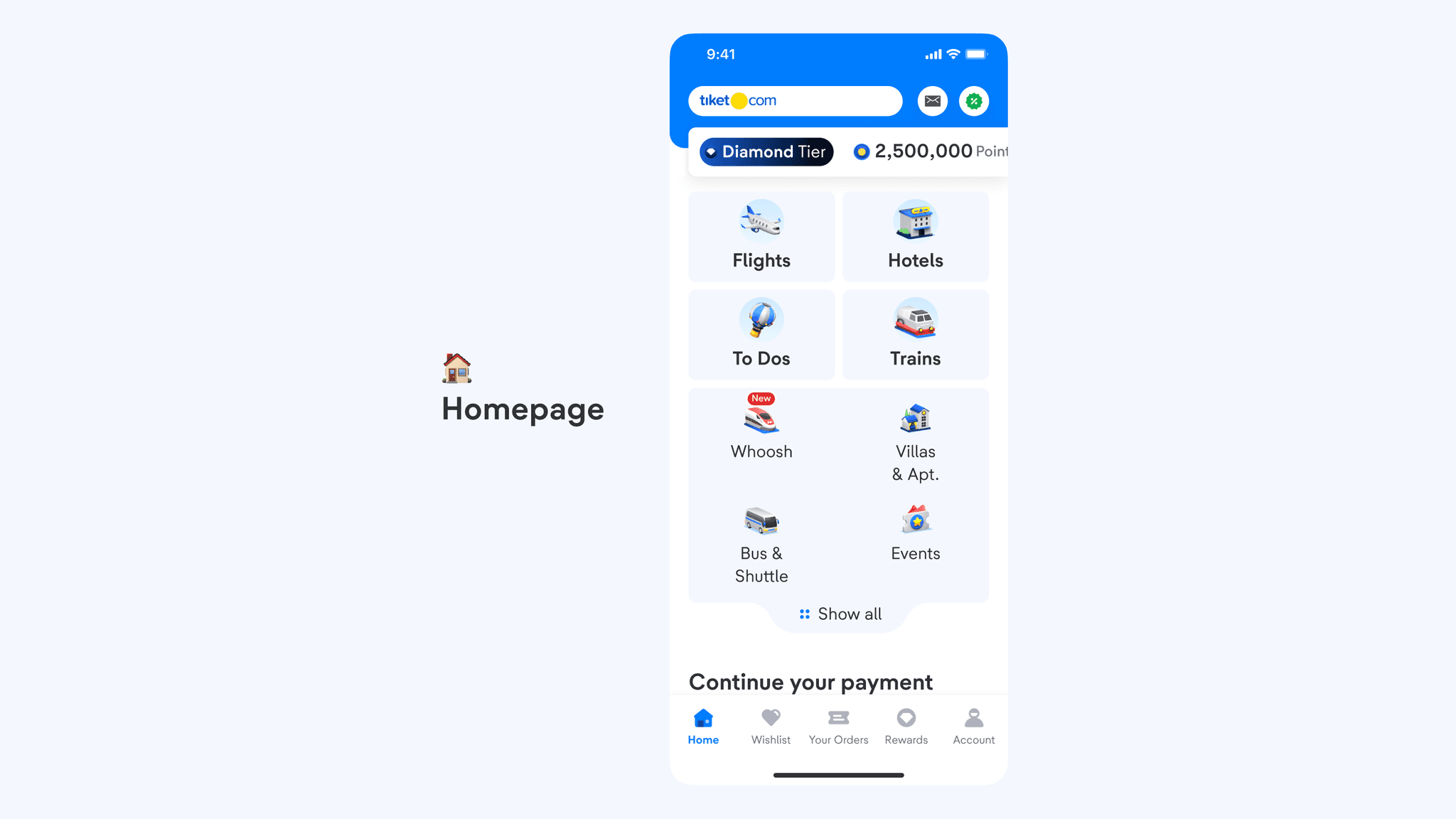
With over 40+ components at our disposal, we prioritized them based on usage and the upcoming homepage revamp. Following atomic design principles, base components like Badge, Ribbon, and Label are given higher priority since they serve as building blocks for larger components.
Our task here is to modify the component capability to support these changes, so we need to pay attention to 3 key aspects:
Width
Text Max line
Text Truncation
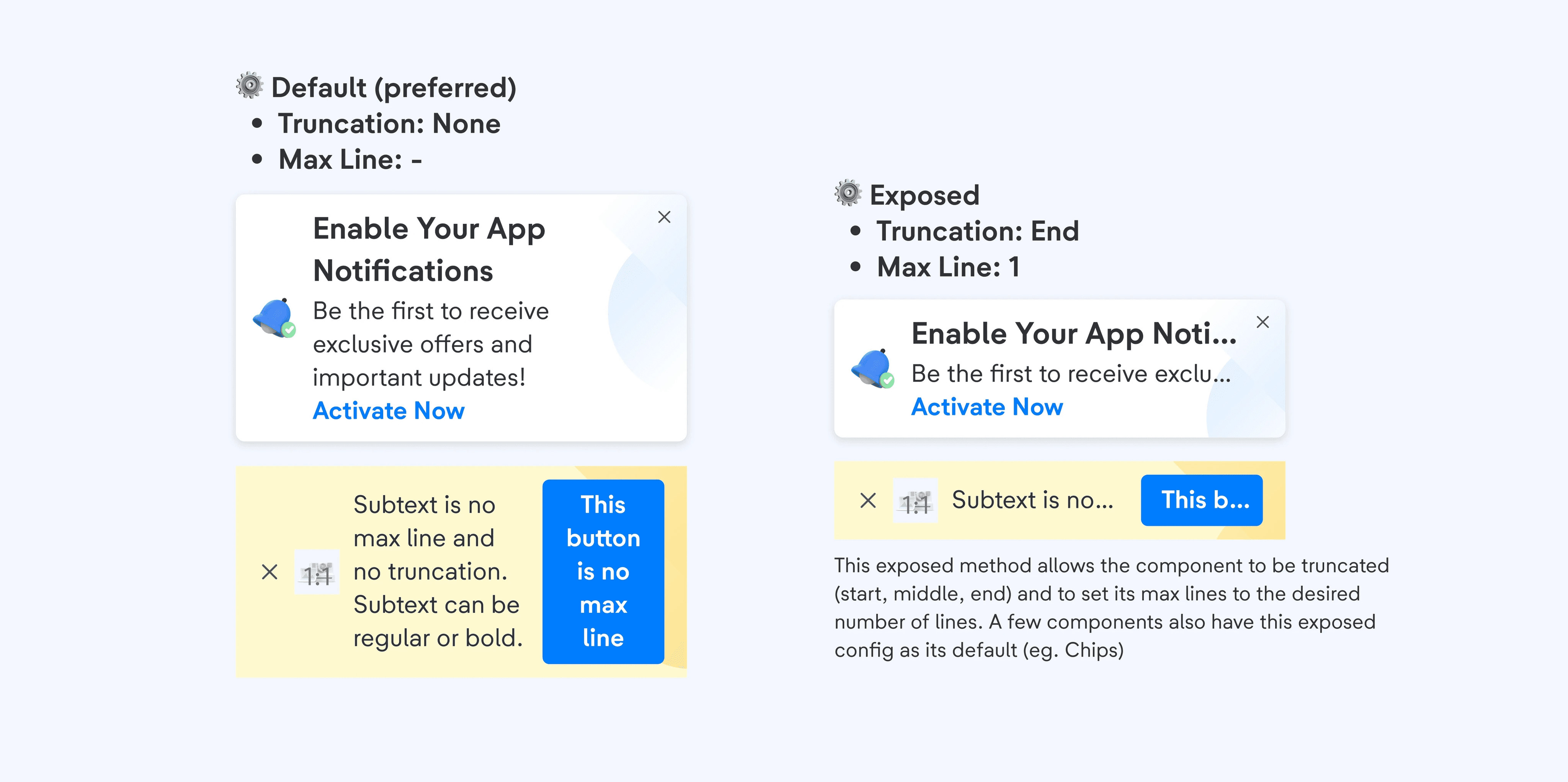
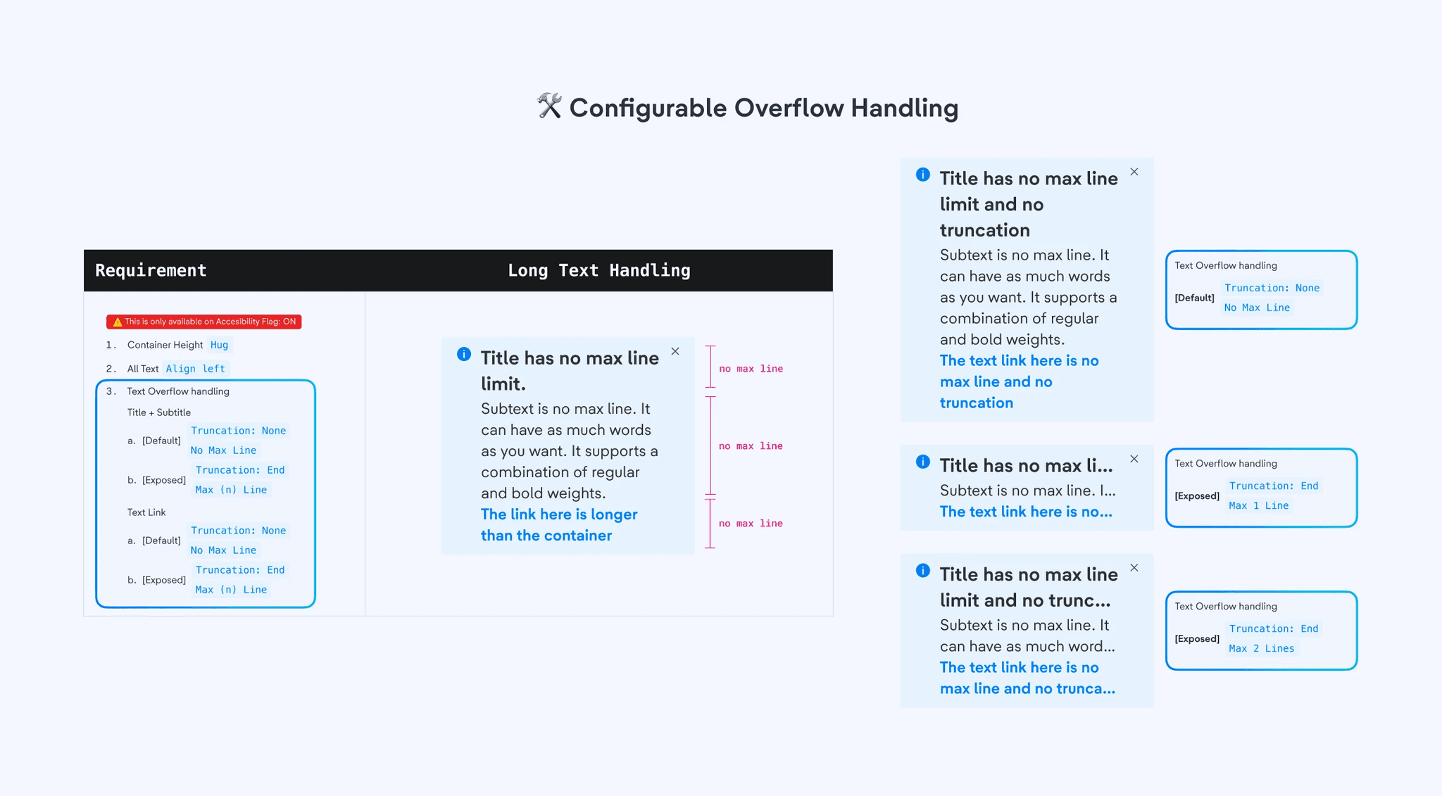
Components have two configurations: Default and Exposed.
By default, truncation is set to none with no max line, but a fallback is provided when needed. The Exposed config allows truncation (start, center, end) and any integer for the number of max lines suited for the design needs.
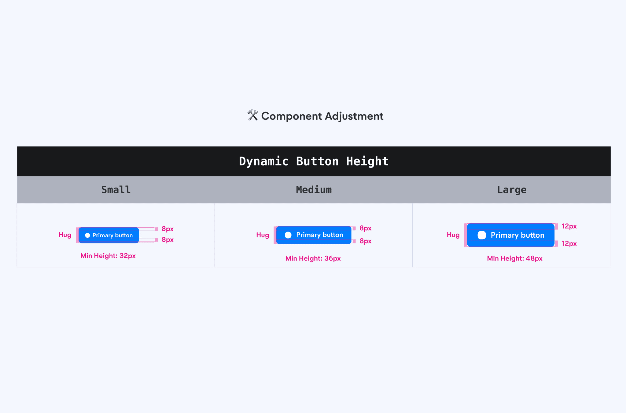
We found that some components, like Buttons, use fixed height (e.g small: 32px, medium: 36px, large: 48px).
This causes issues with dynamic text sizes, as containers can’t adjust to text height. To fix this, components are adjusted to support dynamic height with a defined minimum height.
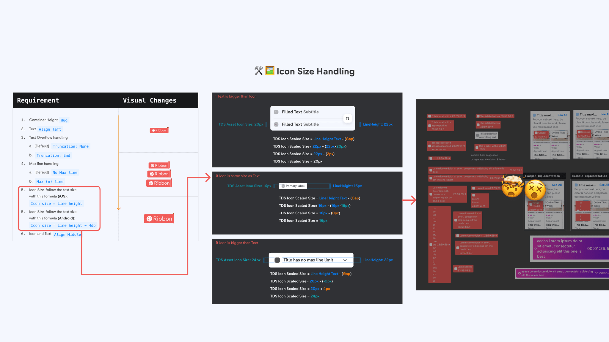
At first, we propose to have icon size adapting to text size, but this created many problems such as deciding what formula for each component. With trial-and-error, this approach is unscalable, inconsistent, and not feasible to pass QA. Given the complex nature of components like Label, which can include start/end icons, text, countdowns, and rolling variants, we decided to opt out adapting icon size to text.
Since this initiative doesn't directly drive revenue, the challenge was getting alignment with verticals (flight, hotel, etc.). With thousands of screens that need to be updated and audited, the scale of change adds to the challenge. By partnering with vertical designers and setting a weekly cadence, we were able to distribute efforts and move the work forward.
Taking it to Scale
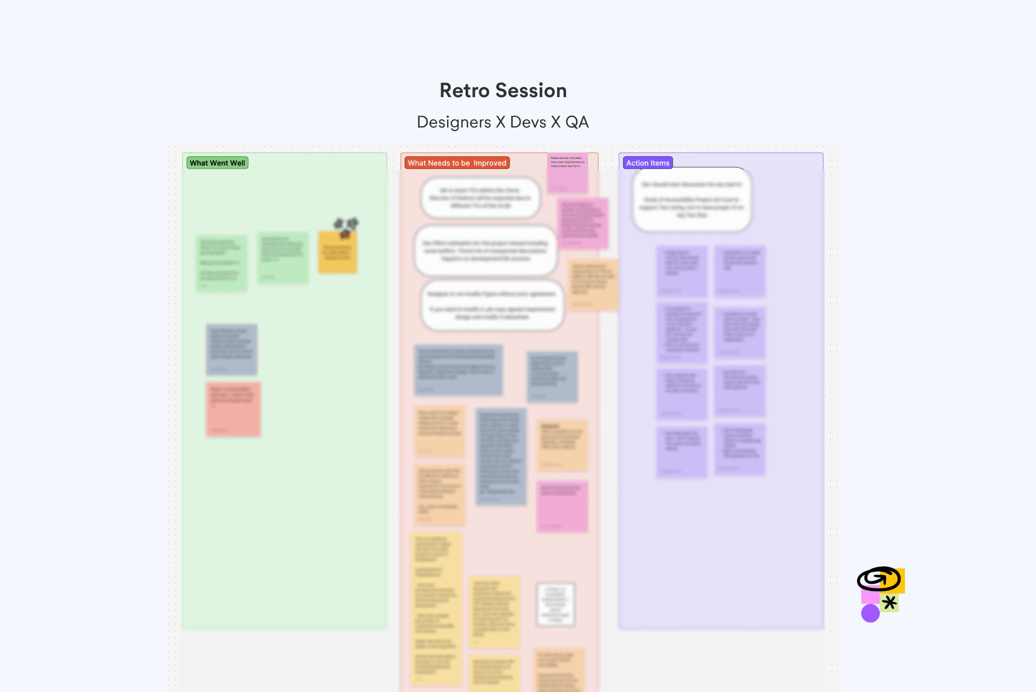
With homepage adoption done and pushed to production, we proceed to conduct retro session to see What Went Well, What Needs to be Improved, and its Action item.
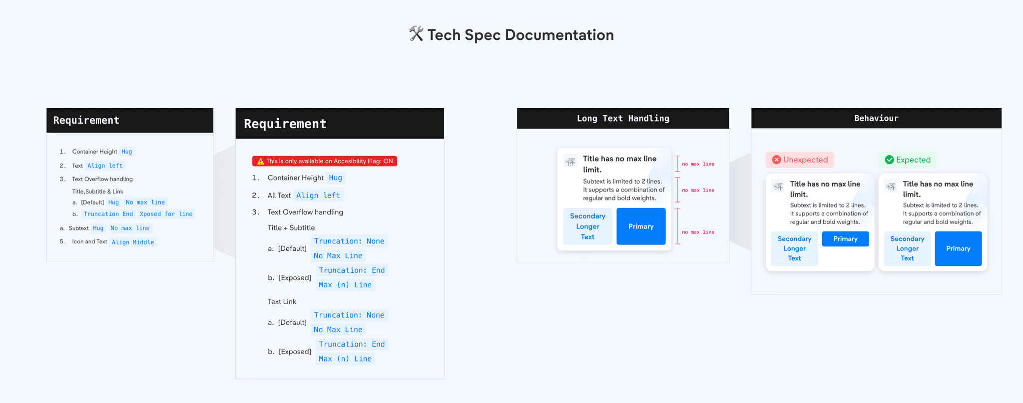
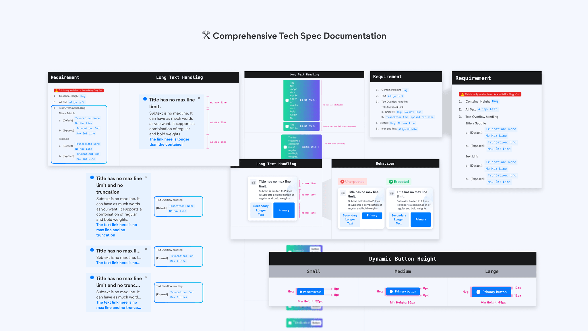
One major bottleneck that was pointed out was our tech spec documentation. From the feedback we received, our tech spec was the culprit of being ambiguous, unclear and not too detail. Thus, we refine our tech spec to include specific details as well as including edge cases example to better communicate our expected outcome.
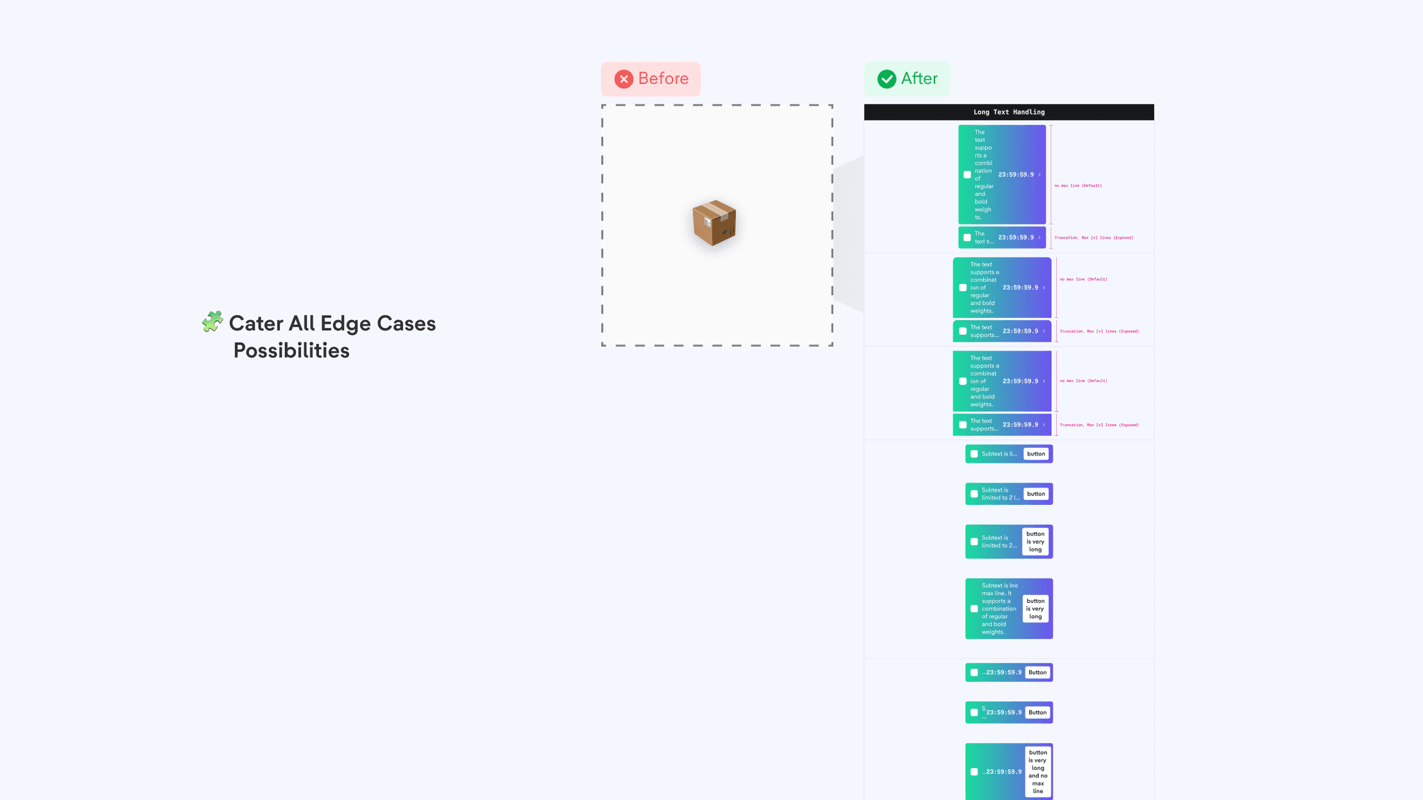
Edge cases that can be found on more complex components are being specified to every possible combinations of text overflow handling, to ensure that the expected behaviour is being shown as reference for the devs.
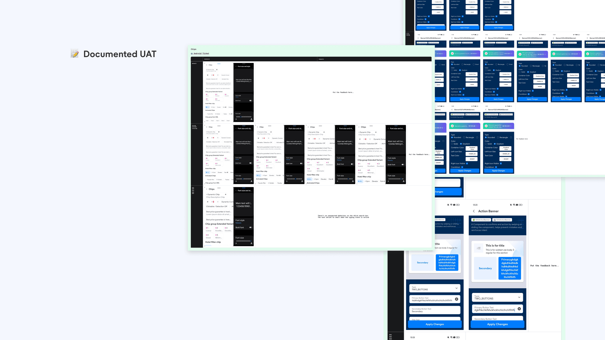
For every reworked component, we make sure that it meets our expectation by conducting UAT and documenting the changes to our tech spec.
With the process in place, we proceed to do for the rest of the components that we have in our Design System.
How It All Comes Together
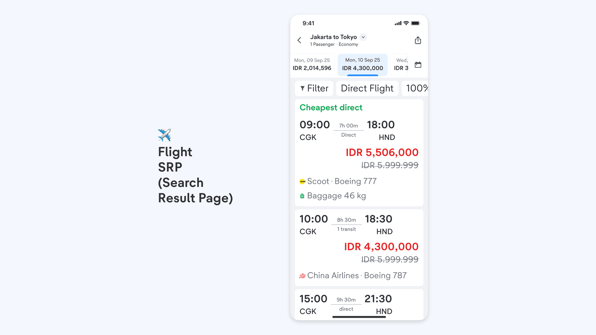
Here are the final looks that we've accomplished, from the principles of handling adaptive text, to every component that we worked on, including its comprehensive tech documentation all the way through to implementation on vertical pages with the largest text.
Impacts
Over the few months that this feature has been integrated, we have successfully:
enabled 500+ stakeholders in product teams to deliver accessible experience
80% adoption rate across product teams supporting 10+ ongoing vertical projects
improved usability of 40+ Design system components by 50%
Summary
This project has been a successful addition to our app, allowing users to customize their in-app experience based on their needs. Since this feature covers every page and screen, it is our utmost responsibility to ensure every user enjoys the best possible experience anywhere in the app.
We see this as a long-term success, reducing drop-offs caused by usability issues and making the app more inclusive for all. Ultimately, it helps us deliver on our mission of providing the best and most delighftful travel experience from start to finish. Going anywhere? You know where to book!
This project shaped my growth in these key skill areas:
Design System
Systems Thinking
Accessibility
Human Centriticity
Process Optimization
Project management
Tech Documentation
Stakeholder management
Made possible by many
A huge shout out to everyone who has made this project a success:
Designers - Zidny, Aufar, Arta
Devs - Pai, Andrew, Vishal, Ihsan, Annu
QA - Rohitash, Okta, Richa, Vipul